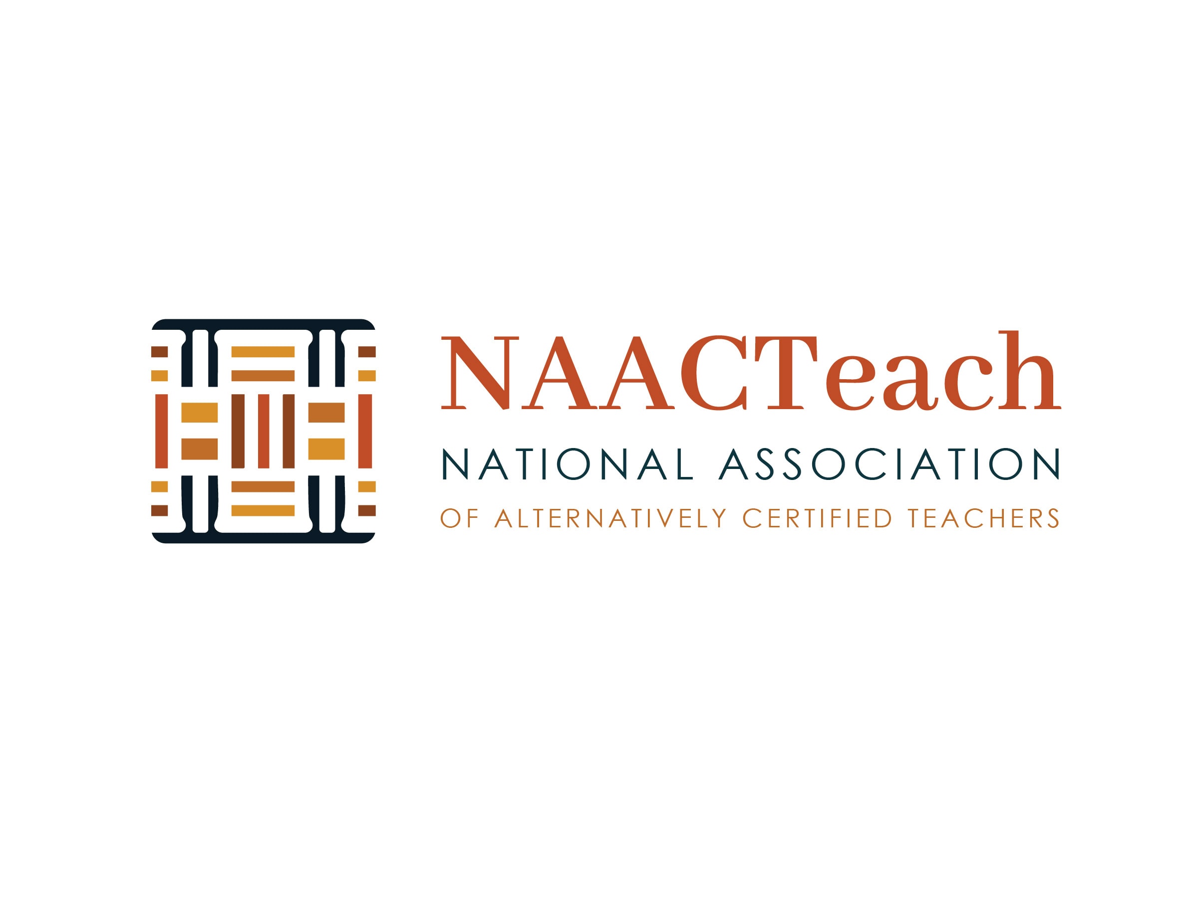
NAACTeach.org LOGO DESIGN Design decisions worth knowing Multicolor primary mark. The knot is woven from rust, amber, and gold set inside a navy frame. The color layering is part of the storytelling; it's what makes the "weaving" concept visible at a glance. Built to flex. The [...]
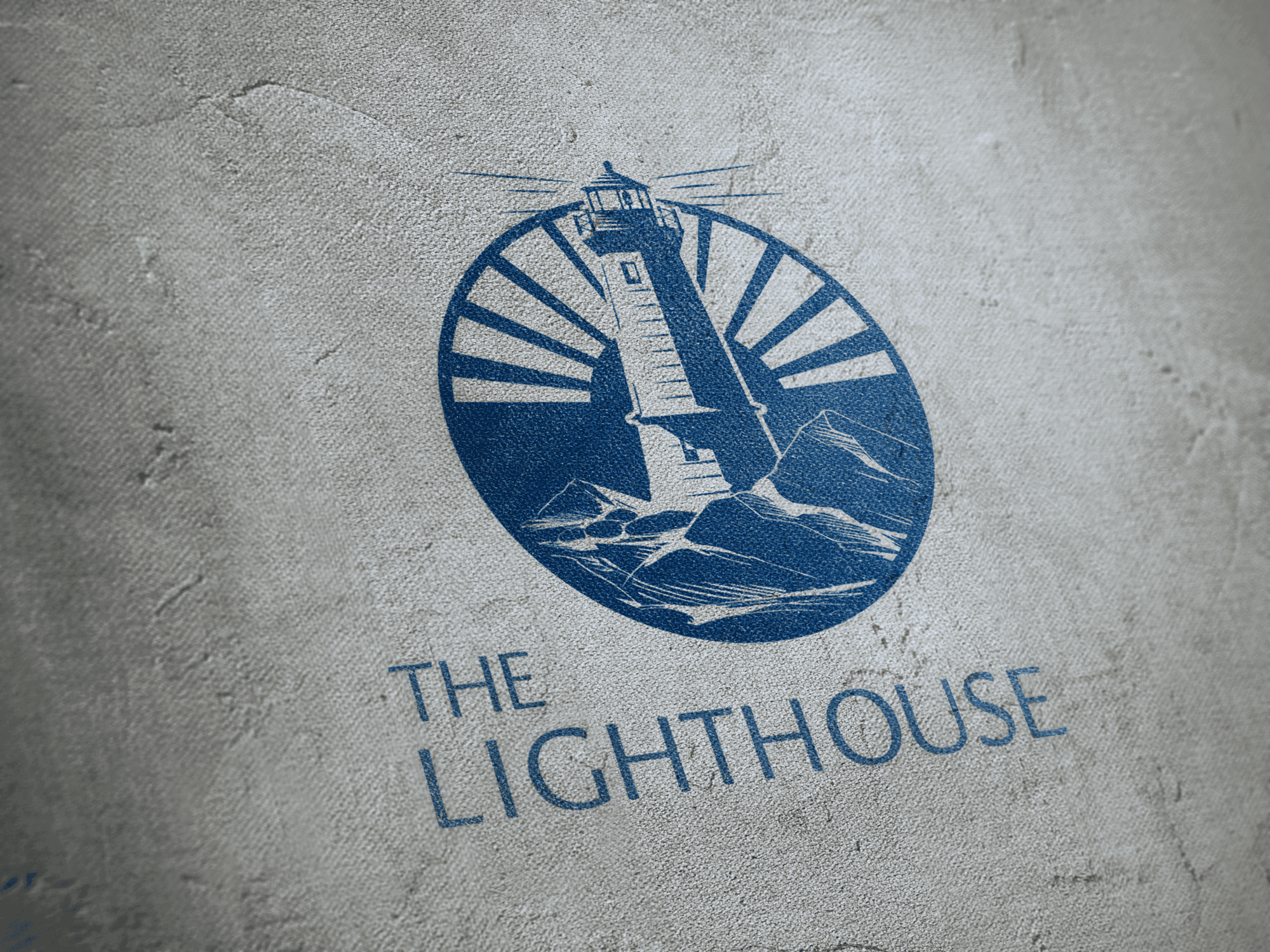
The Lighthouse
Barbara Evans2026-07-28T15:50:21+00:00The Lighthouse LOGO DESIGN Sometimes, the most important part of a design project happens long before the sketchbook ever opens. Our work with Leslie for her new project, The Lighthouse, was exactly that kind of process—rooted in deep conversation, active listening, and uncovering what was already there. [...]
Holding Space
Barbara Evans2026-07-11T17:28:28+00:00Holding Space LOGO DESIGN What the Final Mark Is Doing The mark combines a fluid wave with concentric ripple circles, contained within a triangle, with the wordmark in a flowing script graduated across a warm-to-cool full-spectrum palette. The triangle is deliberate. In somatic work, the practitioner [...]
Journey of Expansion
Barbara Evans2025-10-24T16:51:42+00:00Journey of Expansion LOGO DESIGN Brief Journey of Expansion Some projects unfold like conversations you’ve been waiting to have. Working with Dominique on her Journey of Expansion brand was one of those, rooted in curiosity, trust, and a shared love of blending the [...]
Between Spirit and Story
Barbara Evans2025-10-24T16:40:45+00:00Between Spirit and Story LOGO UPCYCLE PROJECT Brief This was a logo upcycle project, where we took some original concepts from a prior project, left on the cutting room floor and brough back to life in a new context. A way to meet [...]