
The Lighthouse
LOGO DESIGN

Sometimes, the most important part of a design project happens long before the sketchbook ever opens. Our work with Leslie for her new project, The Lighthouse, was exactly that kind of process—rooted in deep conversation, active listening, and uncovering what was already there.
The Design: Recognizing What Was Already There
Designing this logo wasn’t about making something beautiful just for beauty’s sake. It was about finding a visual that could carry the exact same feeling that Leslie’s words already do:
-
Steady.
-
Hopeful.
-
Quietly reassuring.
The best branding usually feels exactly like this. It feels less like inventing something brand new, and much more like recognizing something that was already there all along. We simply gave it a shape.
Brief

The Challenge: A Natural Evolution
Leslie came to us stepping into a new chapter of her work. This wasn’t a complete reinvention or a hard pivot. Instead, it was something that had grown naturally and inevitably from her years of listening, writing, and walking alongside people through incredibly difficult seasons.
She needed a visual mark that didn’t just label her work, but actually felt like her work. It needed to hold space the same way she does.
The Concept: Staying Put
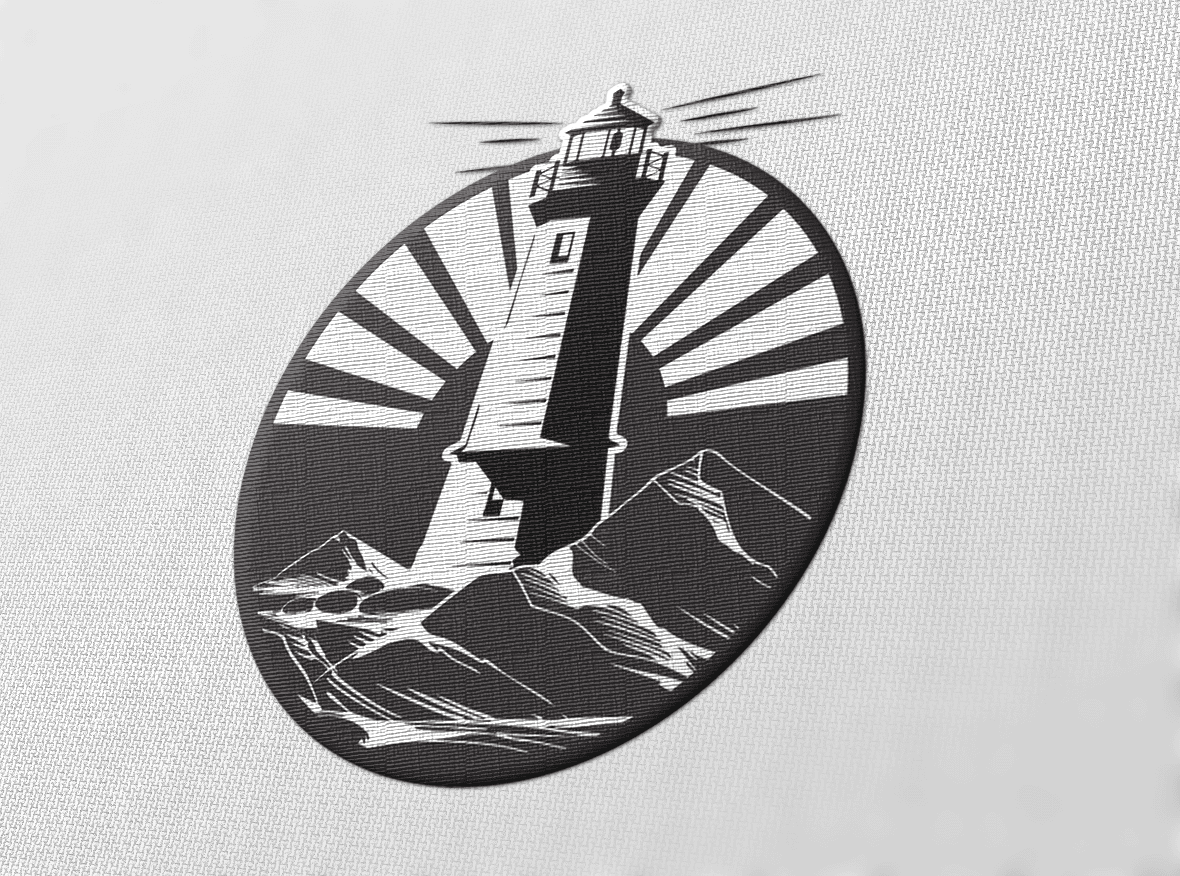
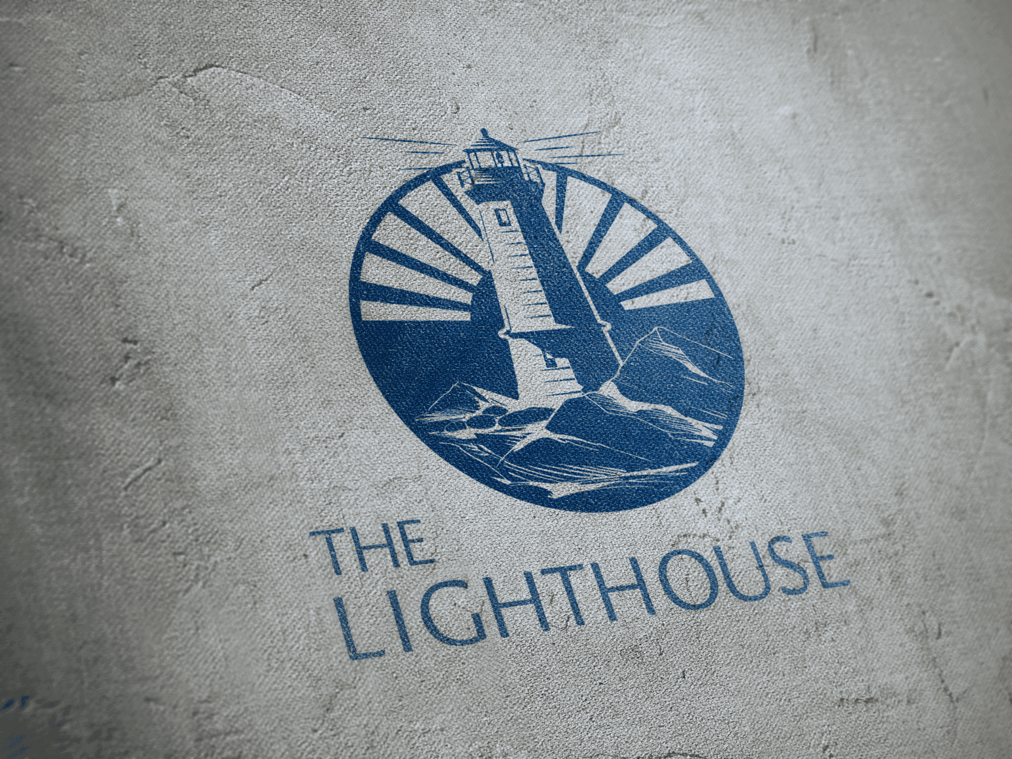
As we talked through her vision and the impact she has on her community, one image kept coming back to us: a lighthouse.
A lighthouse is a very different kind of symbol. It doesn’t chase the boats or try to control the storm. It stays put when the weather changes. It stands firm, keeps the light on, and serves as a reliable guide for those navigating rough waters.
See It In Action
If you’re curious about Leslie’s work and need a bit of steady, hopeful energy in your own inbox, her new project is well worth a read.