Heritage Textiles
LOGO DESIGN

The Exploration
For the first round of logo concepts, I wanted to ensure the options felt distinctive, textural, and metaphorical rather than just literal interpretations of her symbols. We explored a few different pathways:
-
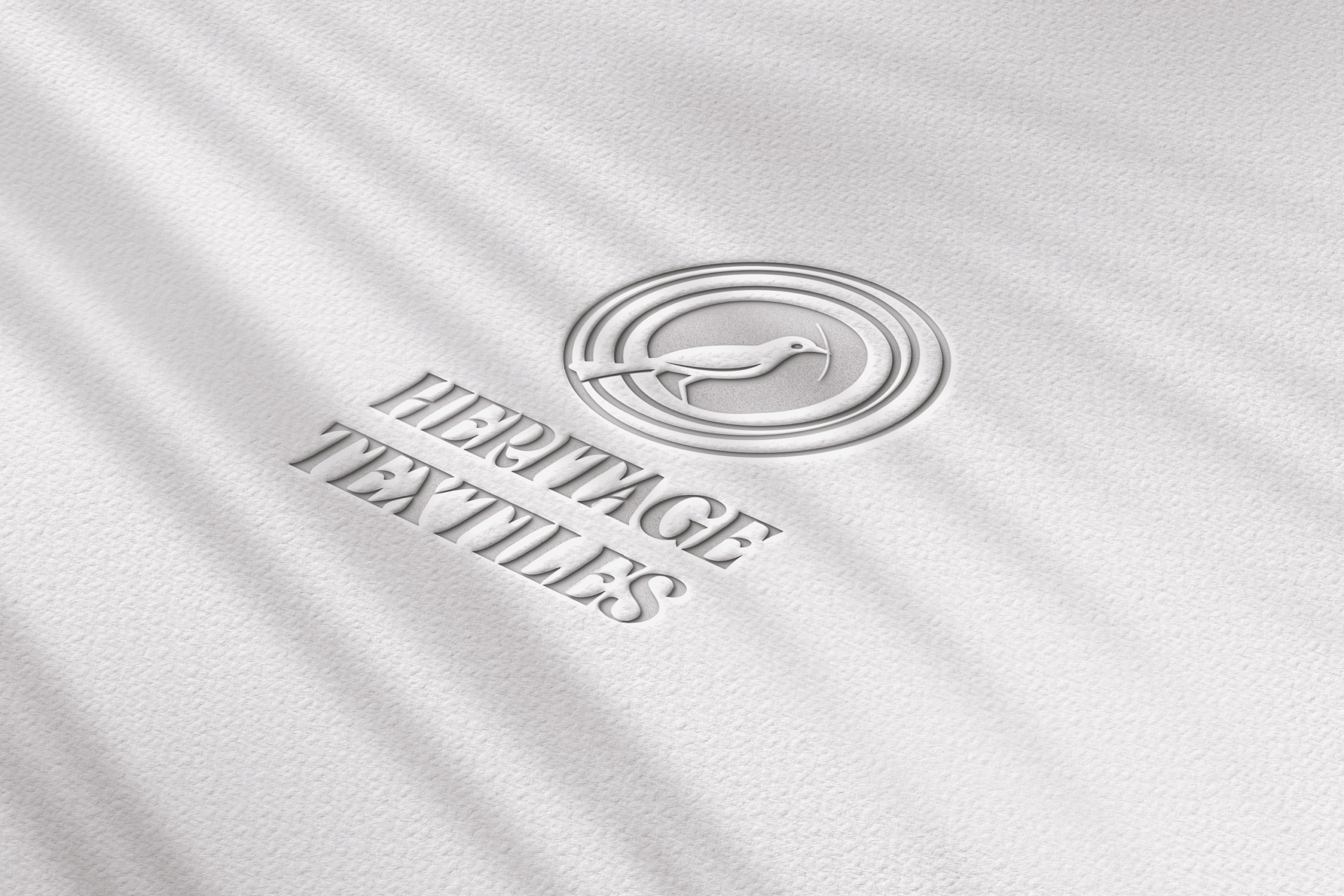
The Weaver Bird: A mark inspired by the weaver bird building its nest, using white space for the bird and concentric circles to represent layers of community woven together.
-
Earthy Patterns: Options built around textile patterns and subtle stitching meant to mimic the actual designs woven by Zola and her students.
-
Loom and Feather: A highly stylized concept that combines a backstrap loom shape filled with a subtle feather texture—a beautiful, non-literal nod to both the loom and the weaver bird.
As with all my branding projects, I presented this initial round entirely in grayscale. Color has a strong psychological influence on how we feel, so assessing the logos without color first allows the layout, texture, and core story to come through clearly.
Brief

Project: Brand Identity & Logo Concepts
Client: Zola Ndimande / Heritage Textiles
I first connected with Zola Ndimande in person during a trip to South Africa, and we immediately bonded over her deep, community-driven vision for Heritage Textiles.
When I began the creative process for this brand, I kept returning to the rich themes from our initial discussions: backstrap looms, the weaver bird, earthy patterns, and the powerful concept of weaving a community together.
The Final Mark: A Woven Community
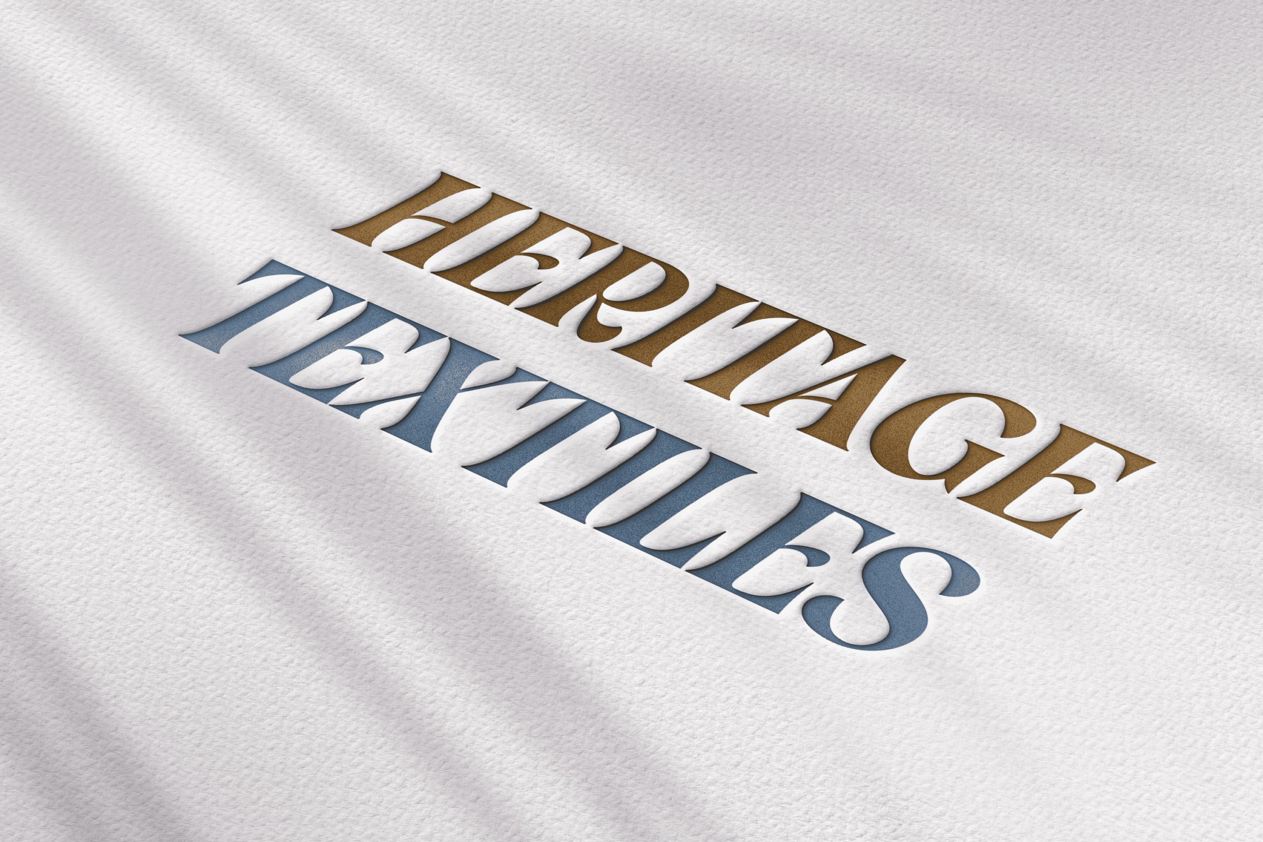
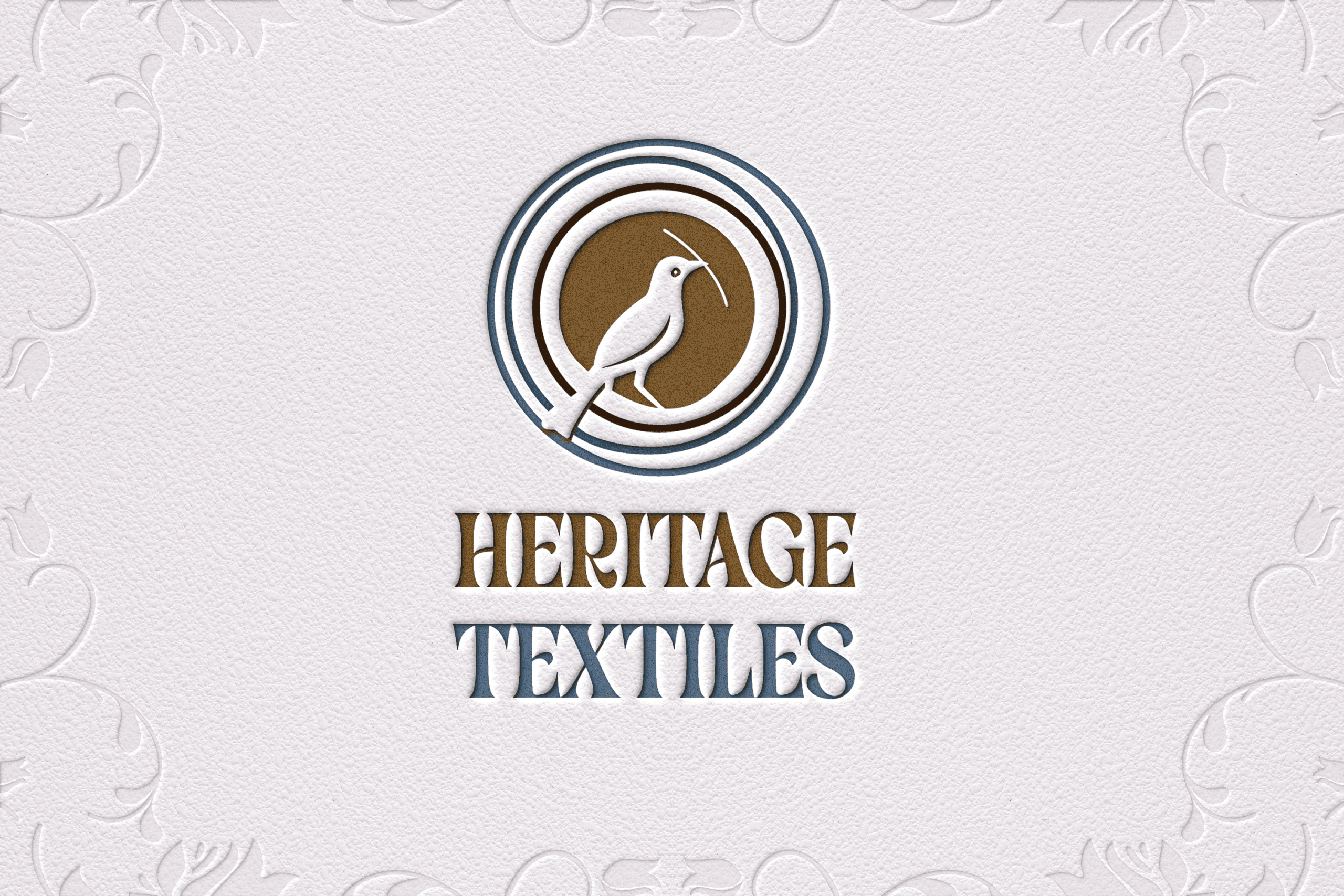
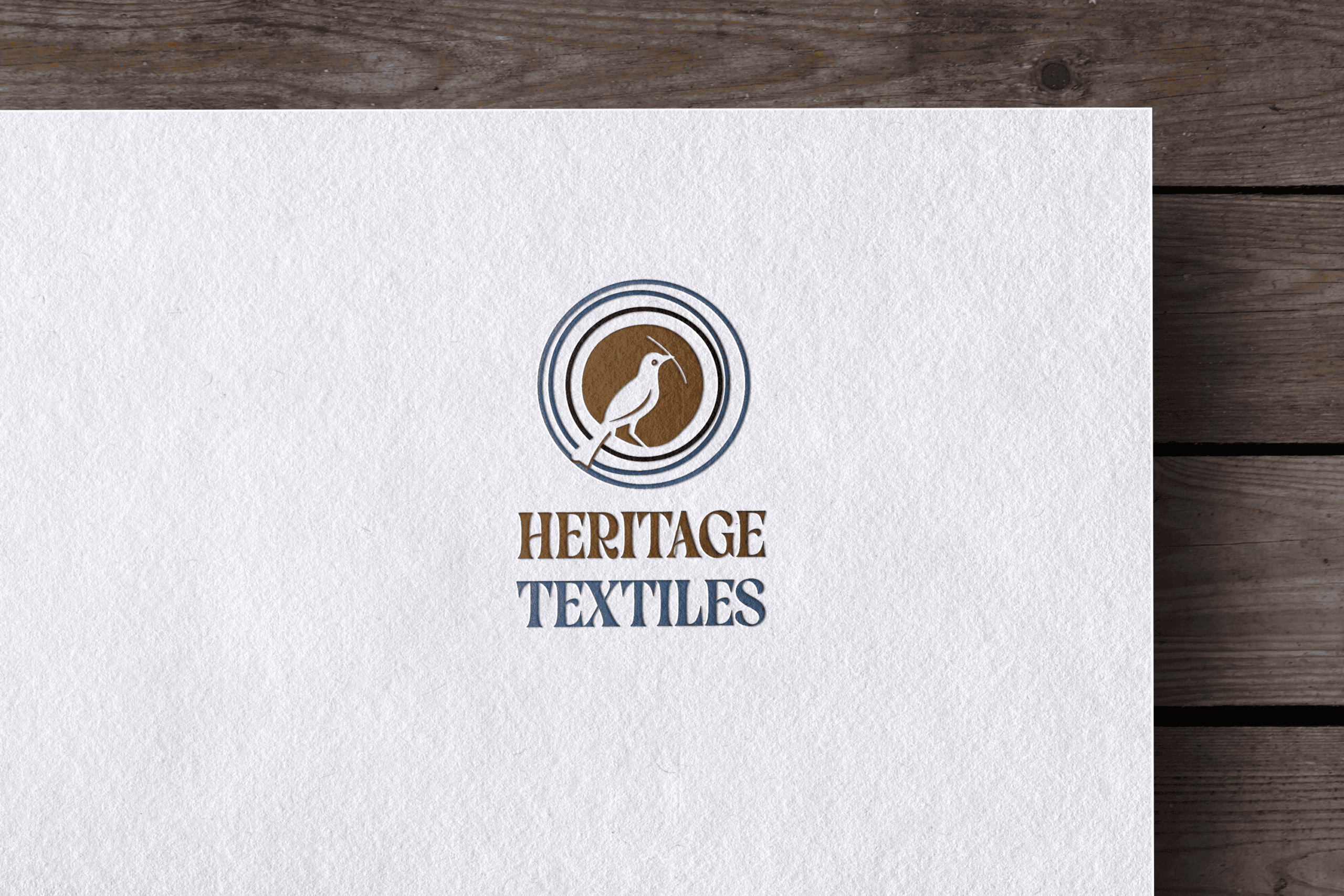
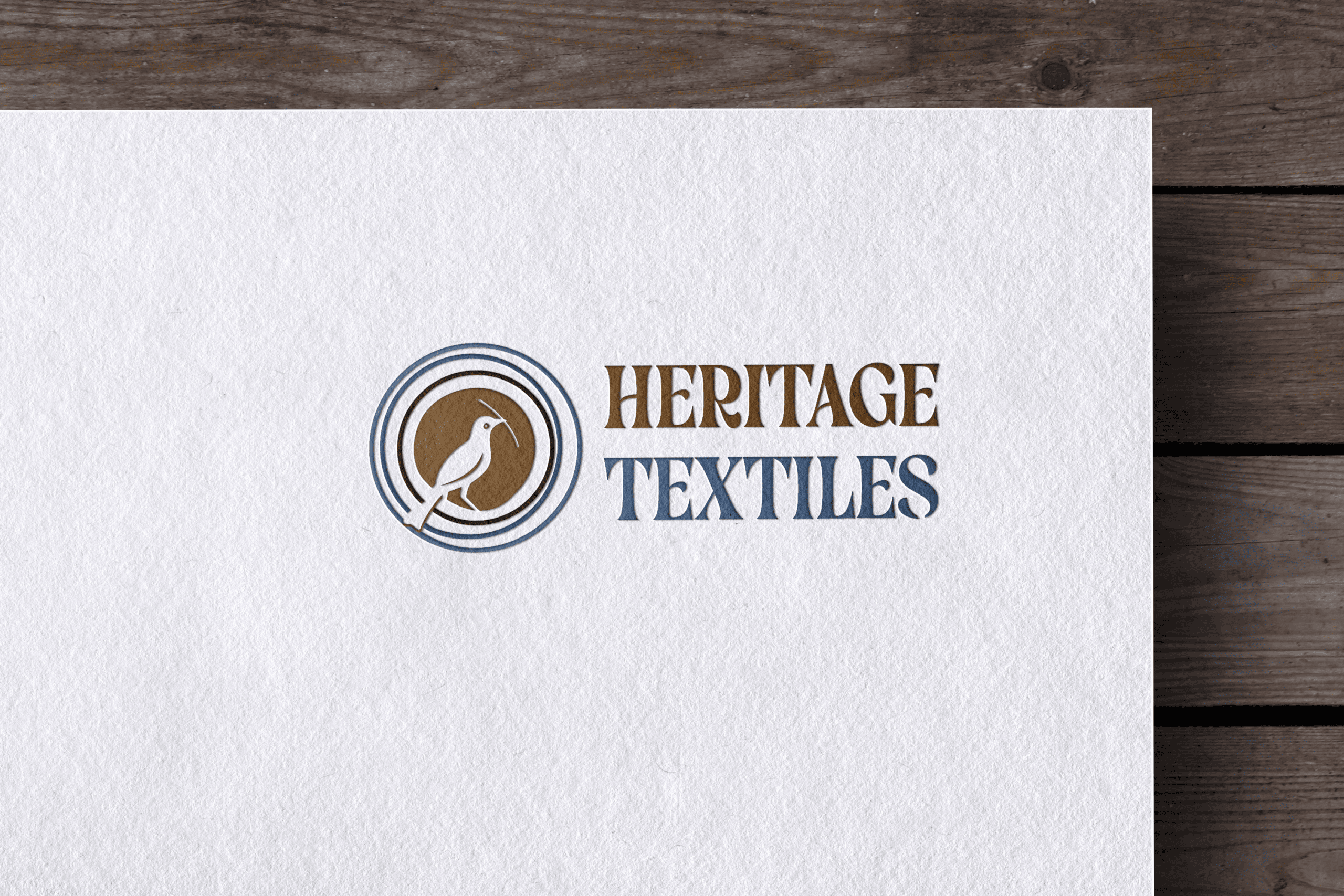
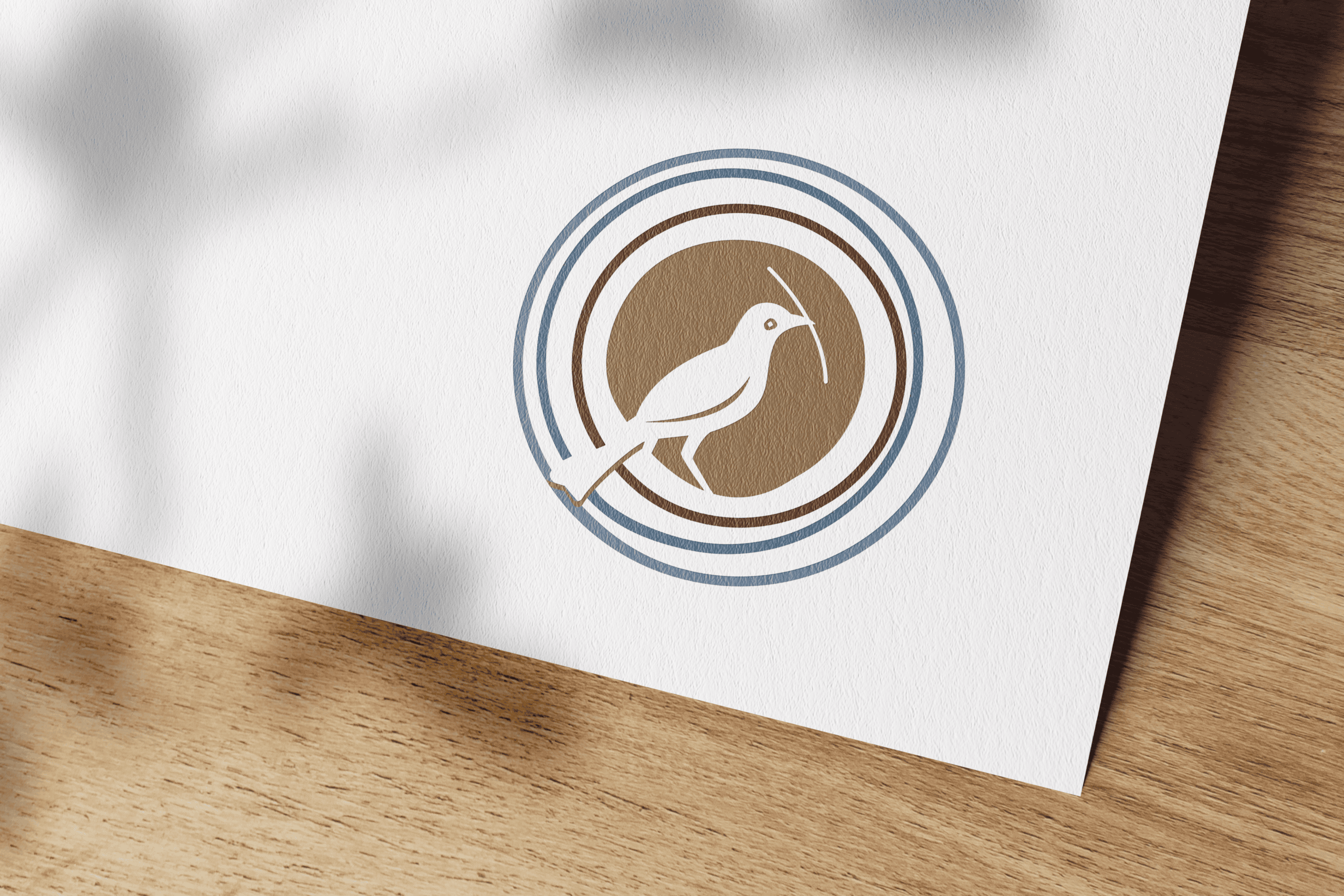
Ultimately, Zola was drawn to the Weaver Bird concept. Once we established the right structure in grayscale, we brought the mark to life with a grounded, earthy color palette. The rich, warm bronze tones paired with a muted slate blue perfectly capture the natural, heritage-driven feel of her work.
The final logo centers the weaver bird within its nest, using those concentric rings to beautifully symbolize the layers of community Zola is actively bringing together. Paired with a strong, slightly textured serif font, the completed brand identity now feels as tactile, steady, and vibrant as the textiles her community creates.