
Fresh Design
KEEPING THINGS CLEAN & SIMPLE

Brief
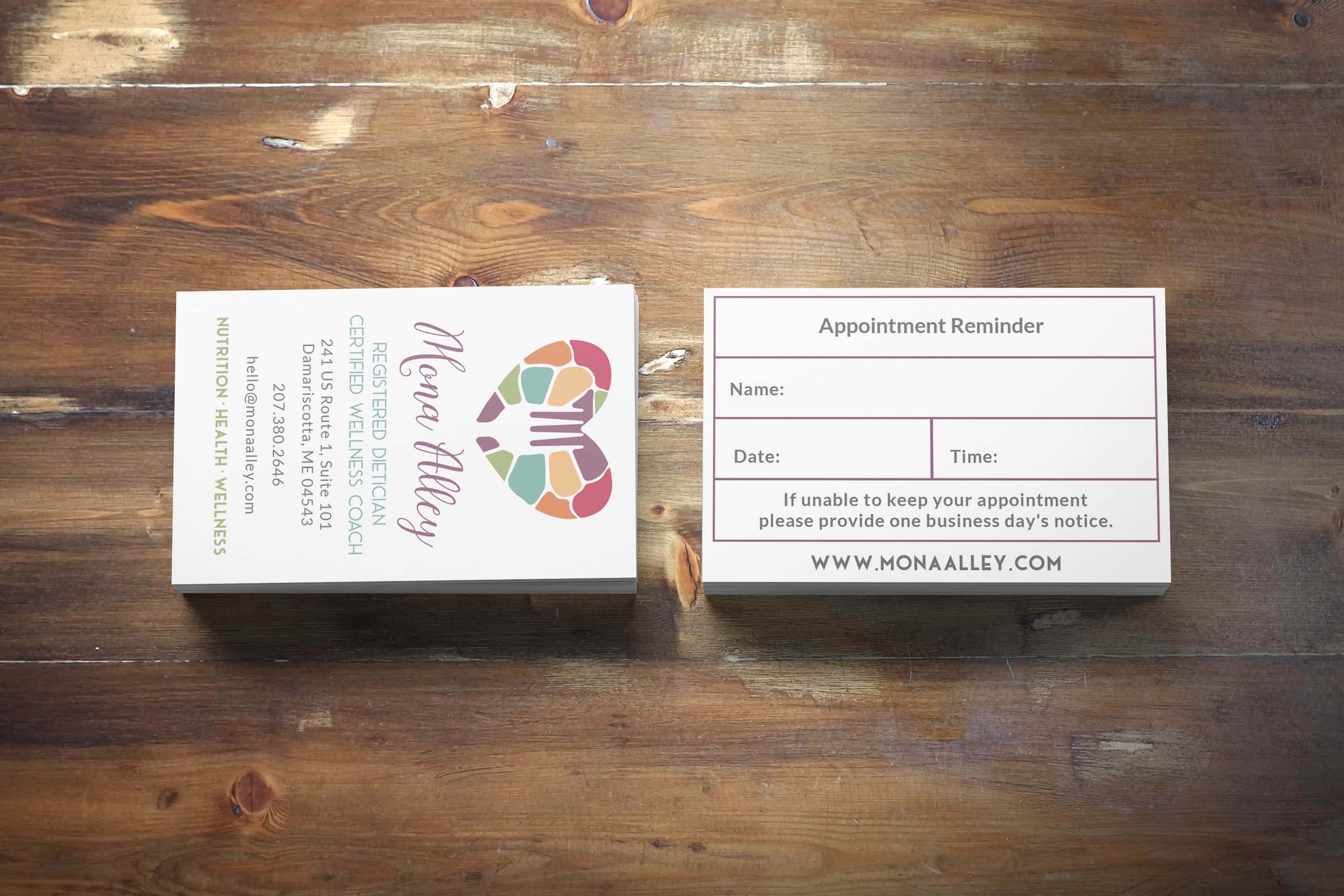
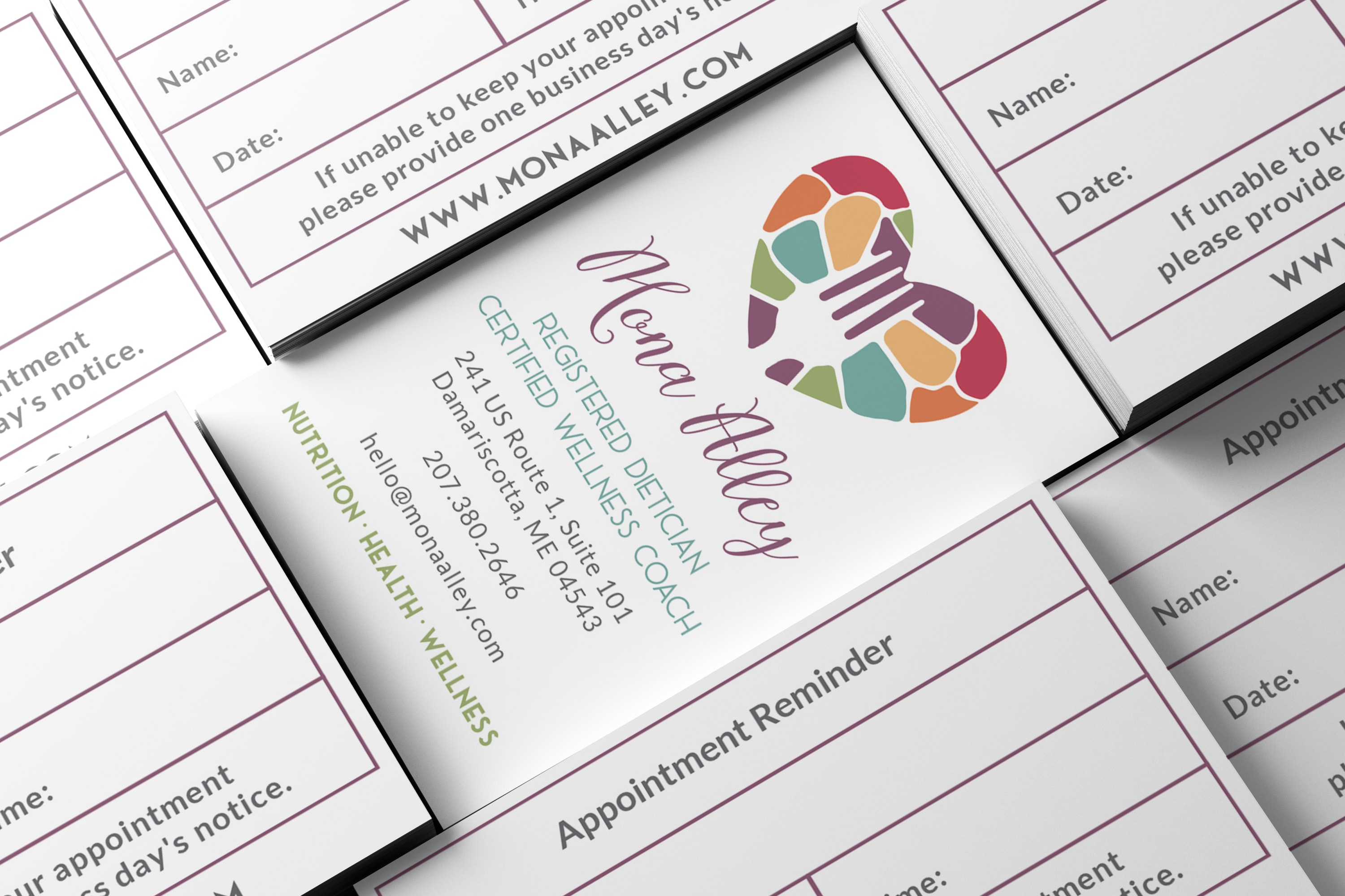
After we did Mona’s lovely new logo and website she needed updated business cards and letterhead. It was important that the back of the card be functional as an appointment reminder. I laid this out in a grid to make the most use of the available space and to keep the information neat and tidy. The front of the card is laid out vertically, because I felt this was the best alignment of her logo while allowing her other details and credentials to be clear and readable.
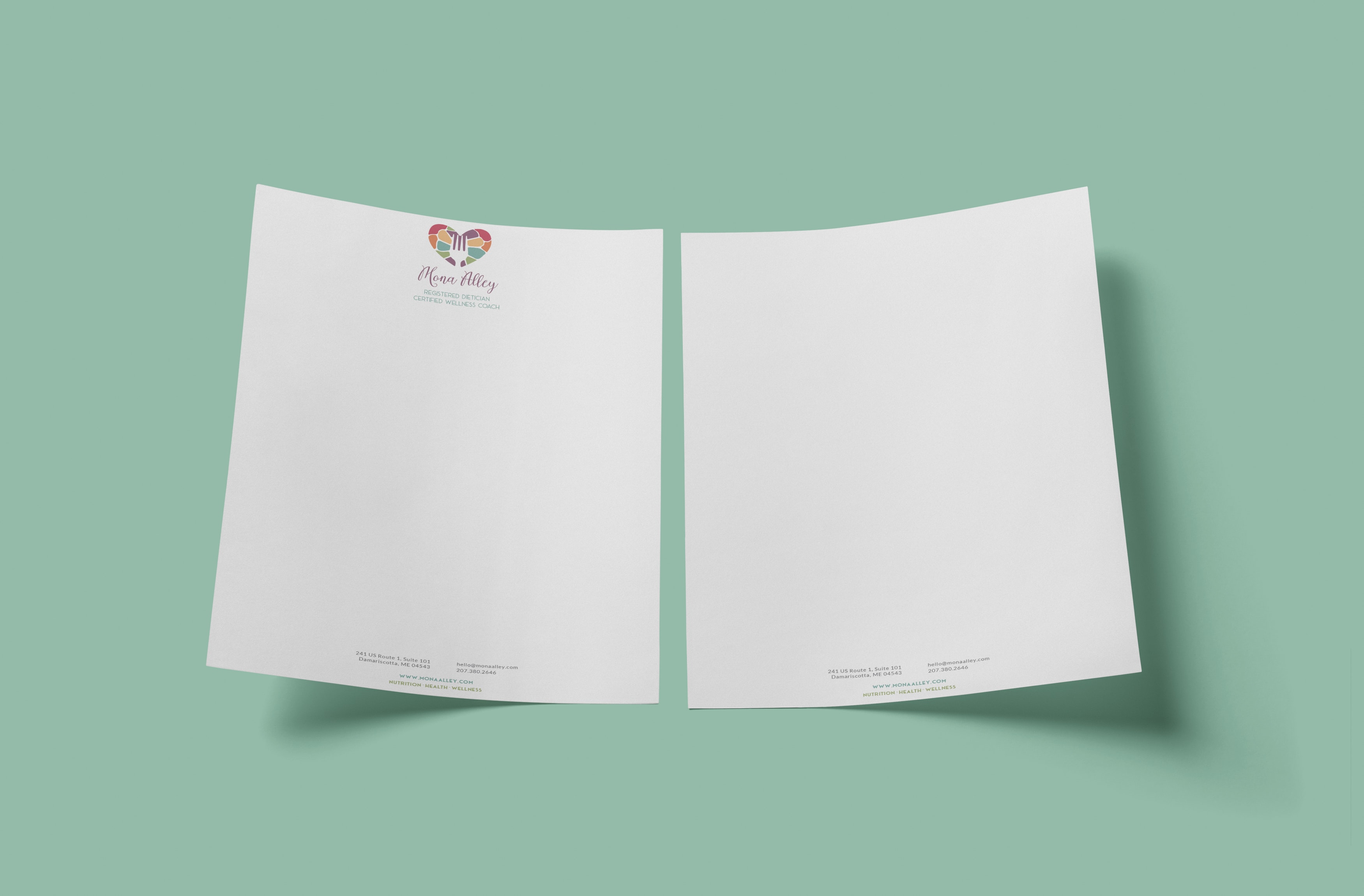
The letter head is similarly spare and clean with a centered treatment that mimics the vertical card layout. I’m still in love with this color set and am so appreciative that Mona came back to me to help round out her business assets!