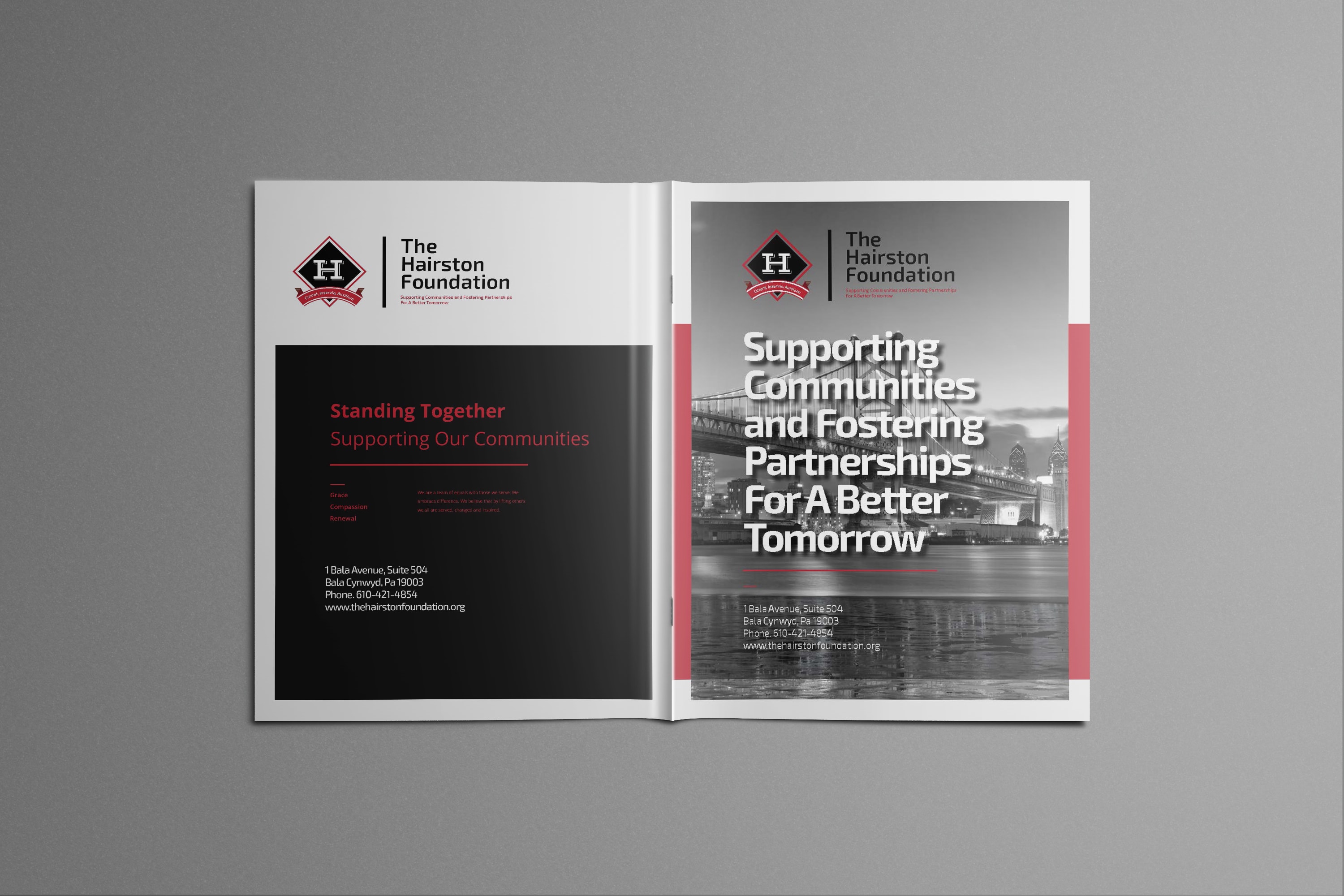

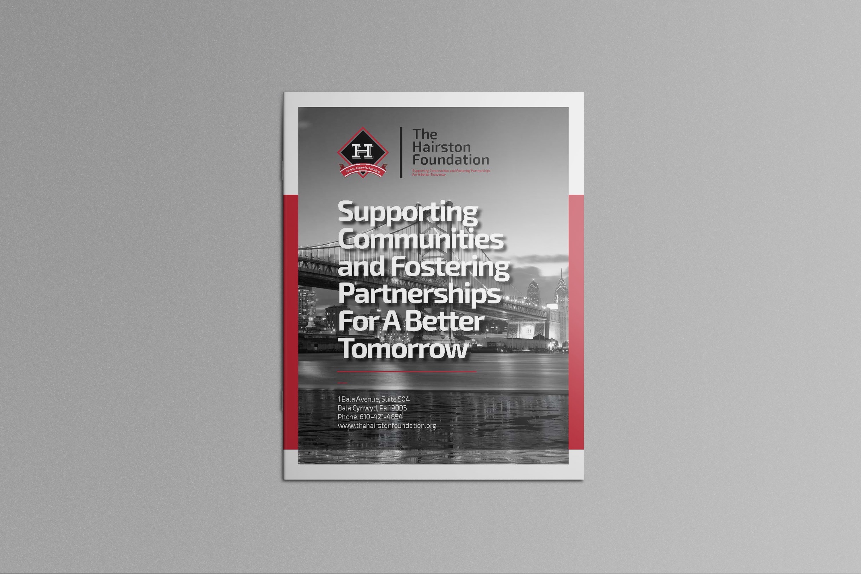
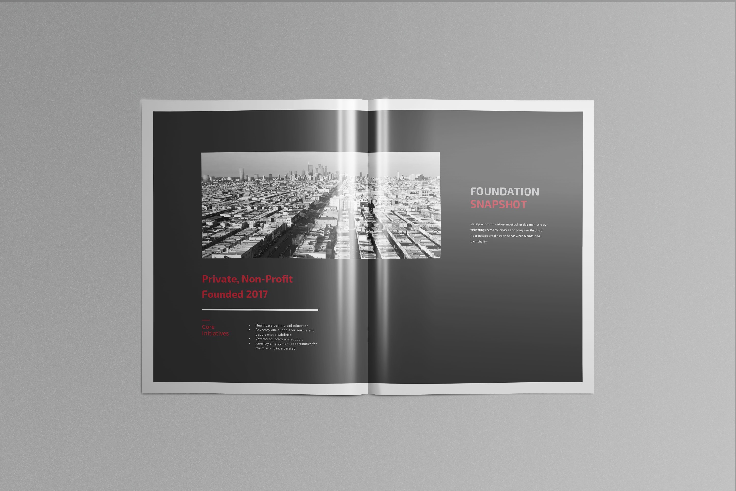
City Skyline and Bold Colors
COLORS, CONSISTENCY & MOOD

The Background
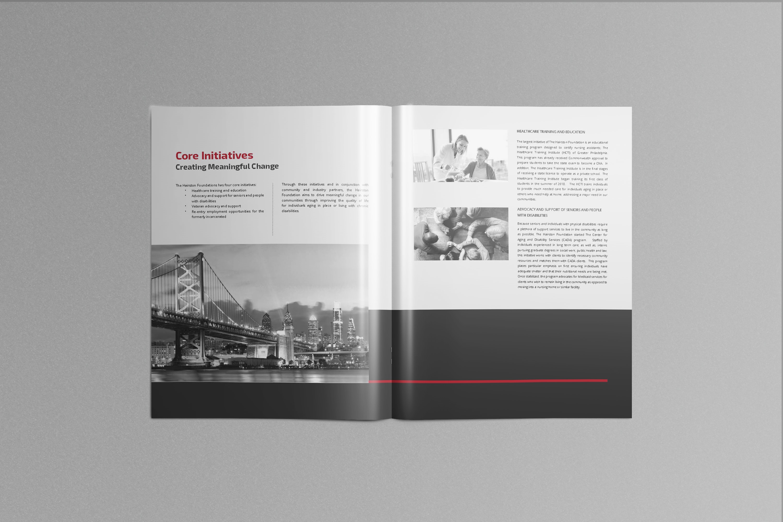
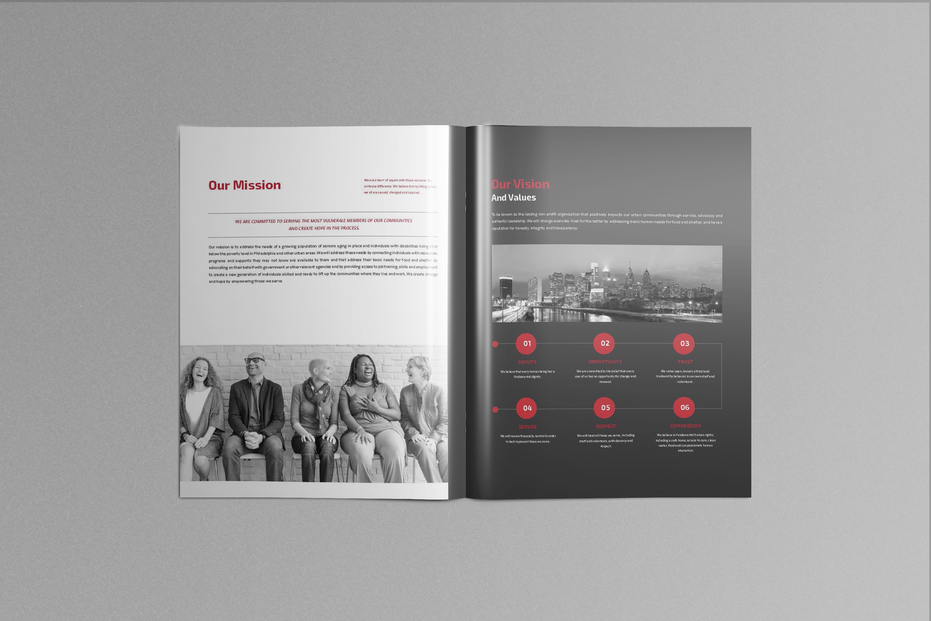
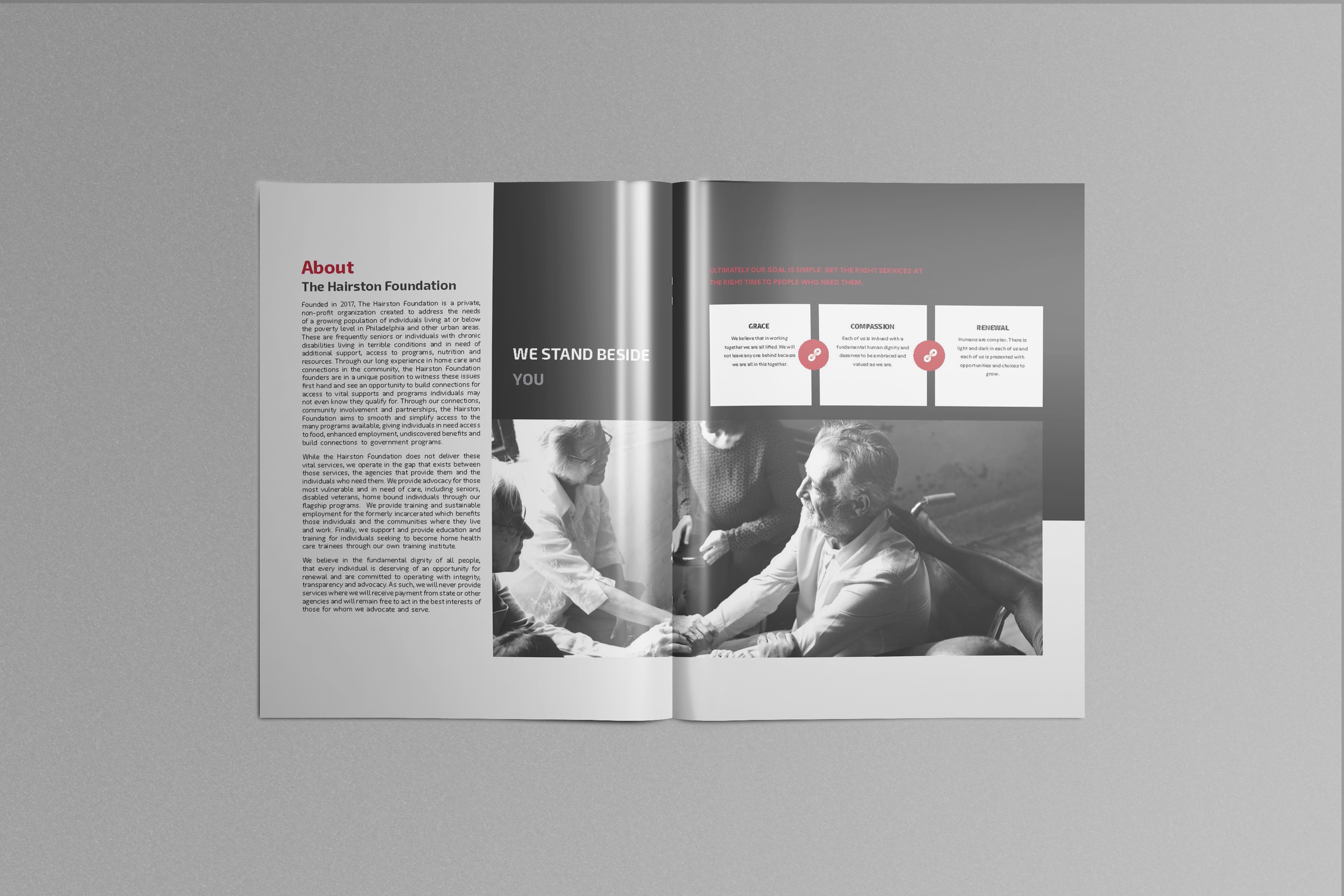
The Hairston Foundation came to me with an existing logo but an undefined brand. They asked me to create a visual identity that represented their very serious mission and values. Once defined, I would then work with their developer to apply the brand to their website (in progress) and other materials. The Hairston Foundation is a private, non-profit organization created to address the needs of a growing population of individuals living at or below the poverty level in Philadelphia and other urban areas. I’m so proud to be supporting their mission by helping them tell their story.
Applying the Brand
We spent some time in interviews and created a design brief, which helped me to define the right colors, type and imagery to be used. The resulting brand guide defined a bold, masculine feel, leveraging pictures of the Foundation’s home city of Philadelphia. This is softened through the use of images of people helping, laughing, interacting and touching. All the photos are treated with a bright, black & white filter to create a feeling of lifting up and hope. The large format brochure is an outgrowth of both the design and content development for the website. Can’t wait to share that with you soon!