NAACTeach.org
LOGO DESIGN

Design decisions worth knowing
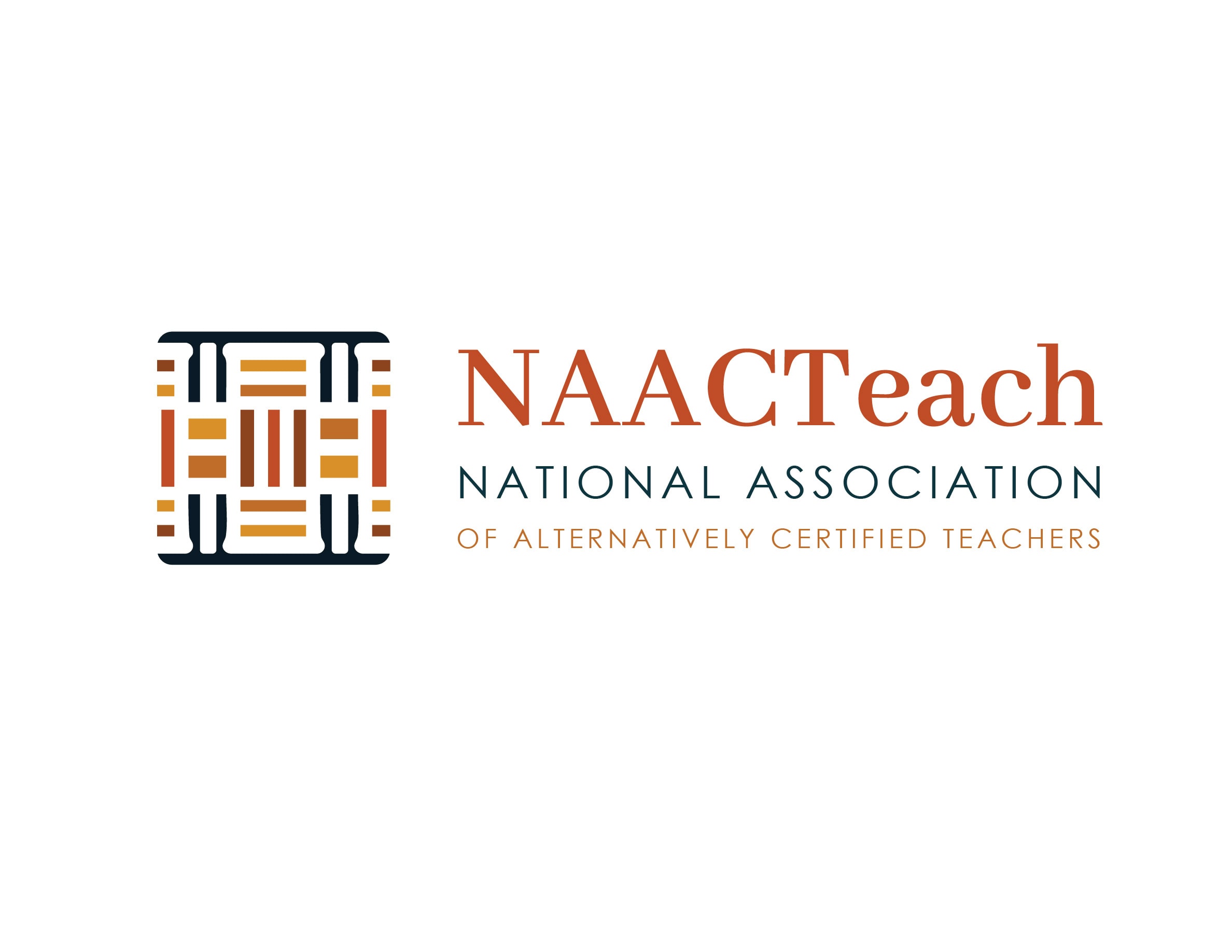
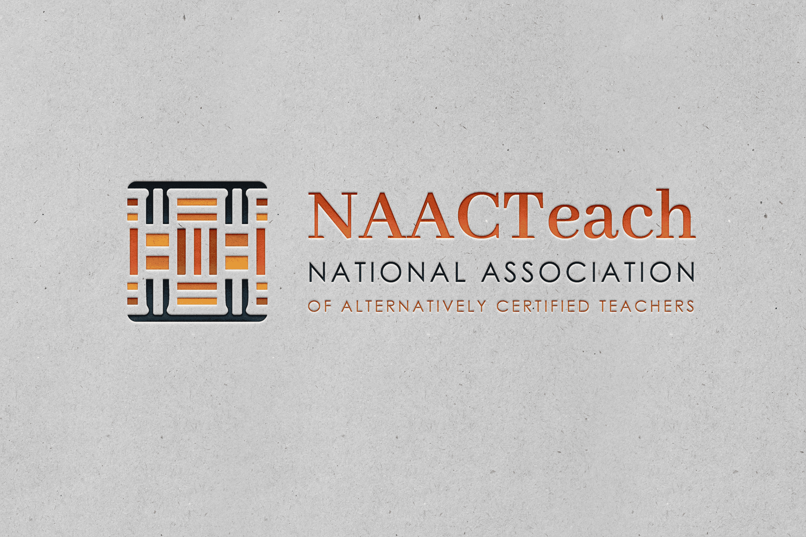
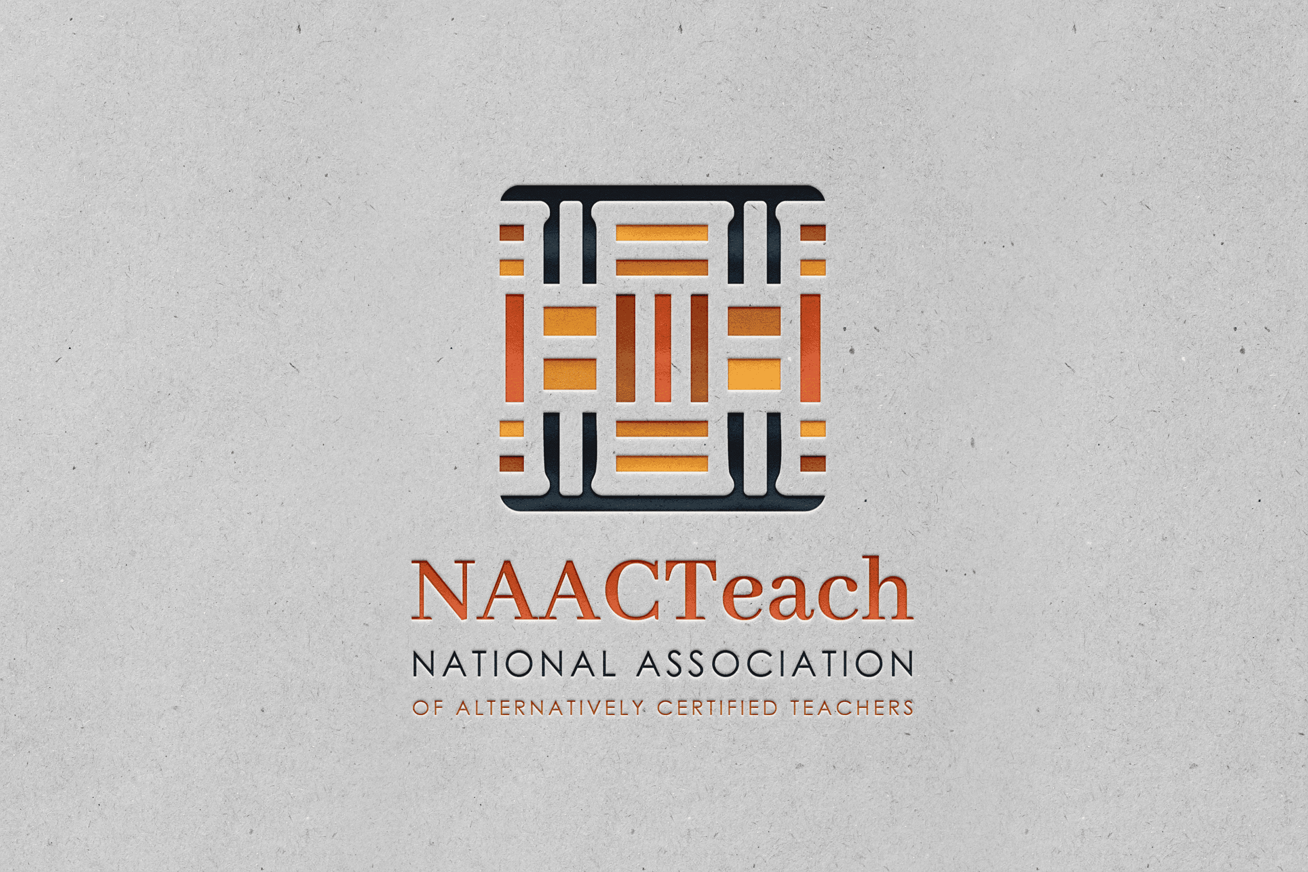
- Multicolor primary mark. The knot is woven from rust, amber, and gold set inside a navy frame. The color layering is part of the storytelling; it’s what makes the “weaving” concept visible at a glance.
- Built to flex. The structure is strong enough to drop down to a single color when a use case calls for it, embroidery, a stamp, a one-color print run, without losing the pattern’s meaning. That was a real, practical requirement from day one, not just a style choice.
- Reads two ways at once. Up close it has architectural precision, sharp lines, deliberate structure. From a distance it holds together as one confident, simple form. That range means it works just as well as a tiny app icon as it does on a banner.
- Built for the tribe, not just the brand. The client’s language throughout the whole process was about people finding “their tribe,” a professional home they hadn’t had before. The knot gives that feeling a visual anchor.
Brief

The Mark: A Woven Knot
The NAACTeach logo builds on the continuous knot, a shape found across West African, Celtic, and Islamic visual traditions. Its roots go back specifically to the Adinkra visual tradition of the Akan people of Ghana. This isn’t a reproduction of one existing symbol; it’s a new pattern grown from the same underlying logic those traditions share: every element depends on every other. Nothing stands alone.
Why this shape, for this organization
The name NAACTeach is direct and literal. It says exactly who the organization serves. That clarity is a strength, but it means the logo has to do the storytelling the name doesn’t. The knot carries that weight. It’s a picture of what the association actually is: a community where teachers, districts, and mentors are woven together, each thread holding up the rest. A single thread pulled loose weakens the whole pattern; a thread added in makes it stronger. That’s the association in one shape.