
Ohio PPO Connect (OPPOC): Designing the Local Alternative
Collaborators: Done Purple & Margaret Pickard (Development)

What made this one interesting:

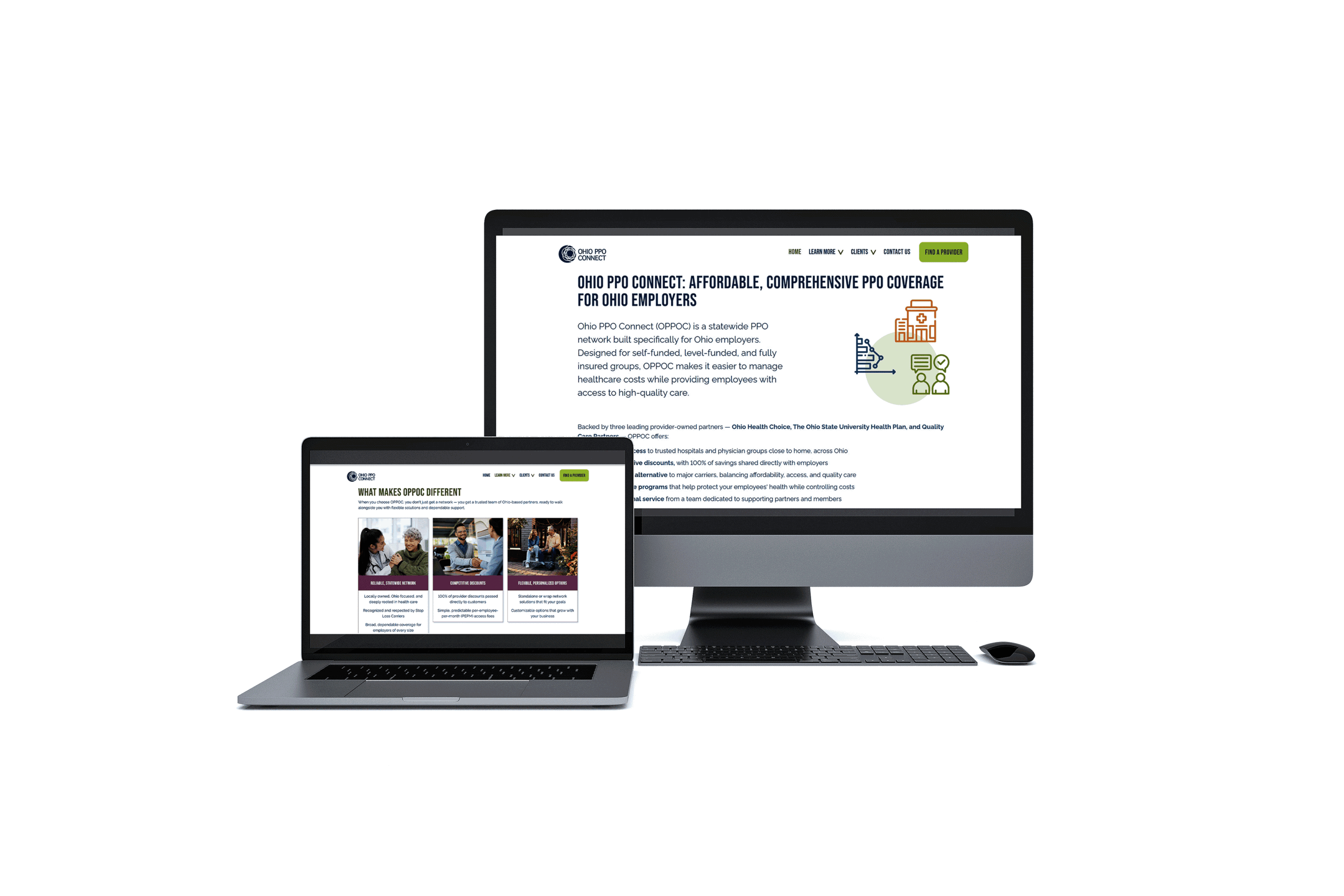
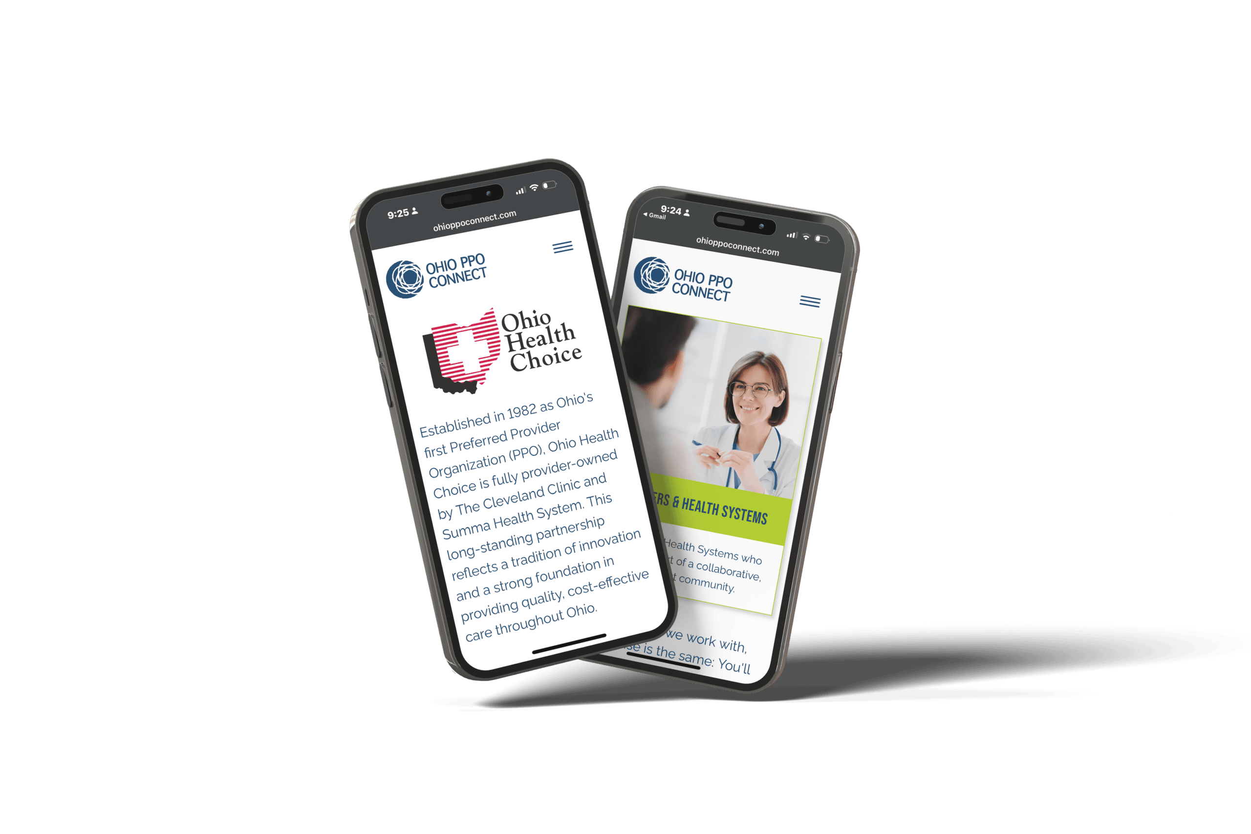
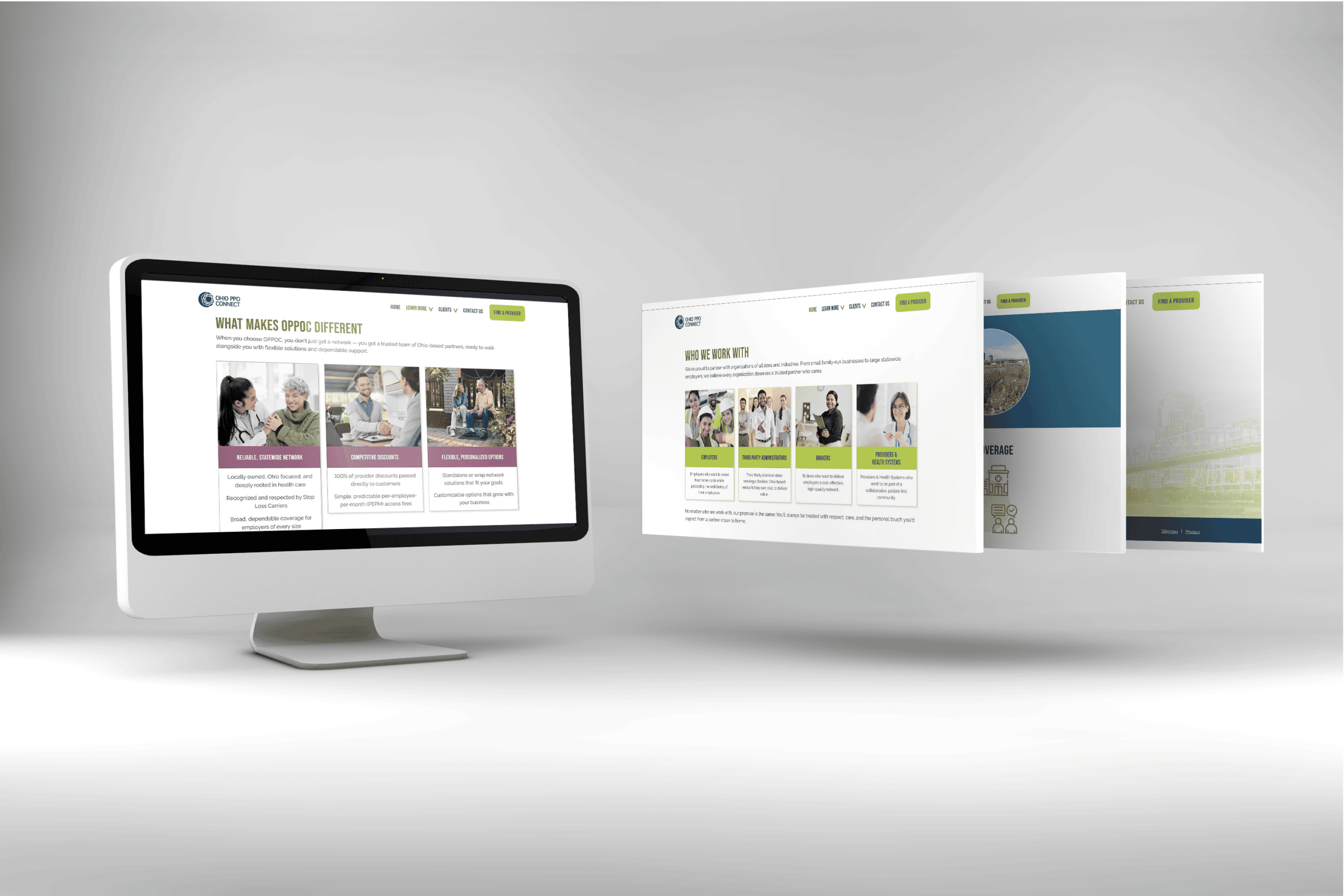
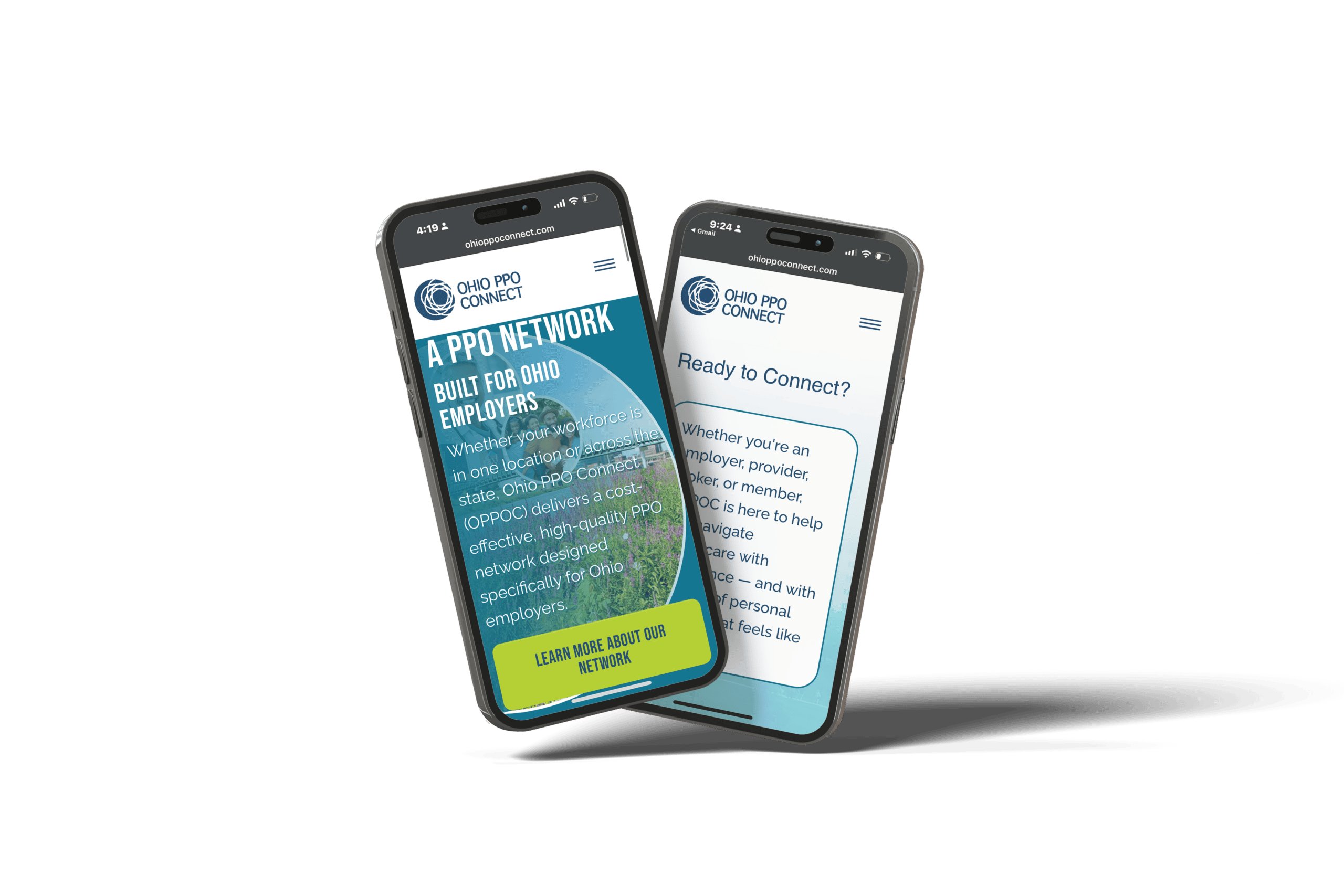
- The positioning challenge: how do you communicate trust and credibility without sounding like every other insurance brand? We leaned into “grounded system with moments of energy”: blues and grays doing the steady work, orange used sparingly for emphasis and forward motion.
- A circle motif tied everything together visually, echoing the OPPOC logo and reinforcing the idea of connection and network.
- Typography paired a flexible modern grotesque (Archivo) with a punchier headline font (Bebas Neue) for contrast between body content and impact moments.
- The whole system was built to scale beyond the website into future sales materials and marketing, not just solve for one deliverable.
The Collaboration:
Done Purple brought the site to life on the dev side, and Margaret Pickard brings the designs to life with her technical skill and eye for detail. Team execution matched the strategy: clean, cohesive, no wasted motion.
Testimonial:
“I really appreciated how collaborative and easy you were to work with. You took the time to understand our goals and vision, while also bringing your own expertise and recommendations to the process. You were very receptive to feedback, patient as we coordinated input from multiple organizations, and great at finding solutions when challenges came up. Overall, you made what could have been a complicated process feel smooth and enjoyable, and we really appreciated the partnership.”
The OPPOC Project Team