Zen & Vitality with Zoa
DESIGNING A CALM ALIVE & ENERGIZING BRAND

Brief

A long time friend is launching her own private practice that uses yoga and other modalities to help her clients feel calm, alive and energized. She needed a logo to represent her brand to get started as soon as possible. She was getting keys to her new studio in under two weeks and we needed to create a brand quickly. We agreed that other design elements or materials may be needed down the road, but for now we wanted to focus on getting to a logo that told the right story.
We opted at some concepts that gave us a quick path forward. I showed here some logos that were designed in another project workup, but ultimately were not right for that client. They represented well thought out pieces that could stand on their own and could have application for Zen & Vitality. We looked for themes
of blossoming or growing, potential mathematical tie ins, cherry blossoms for both a local connection and Asian flair and type faces that captured any of these feelings and could include brush strokes.
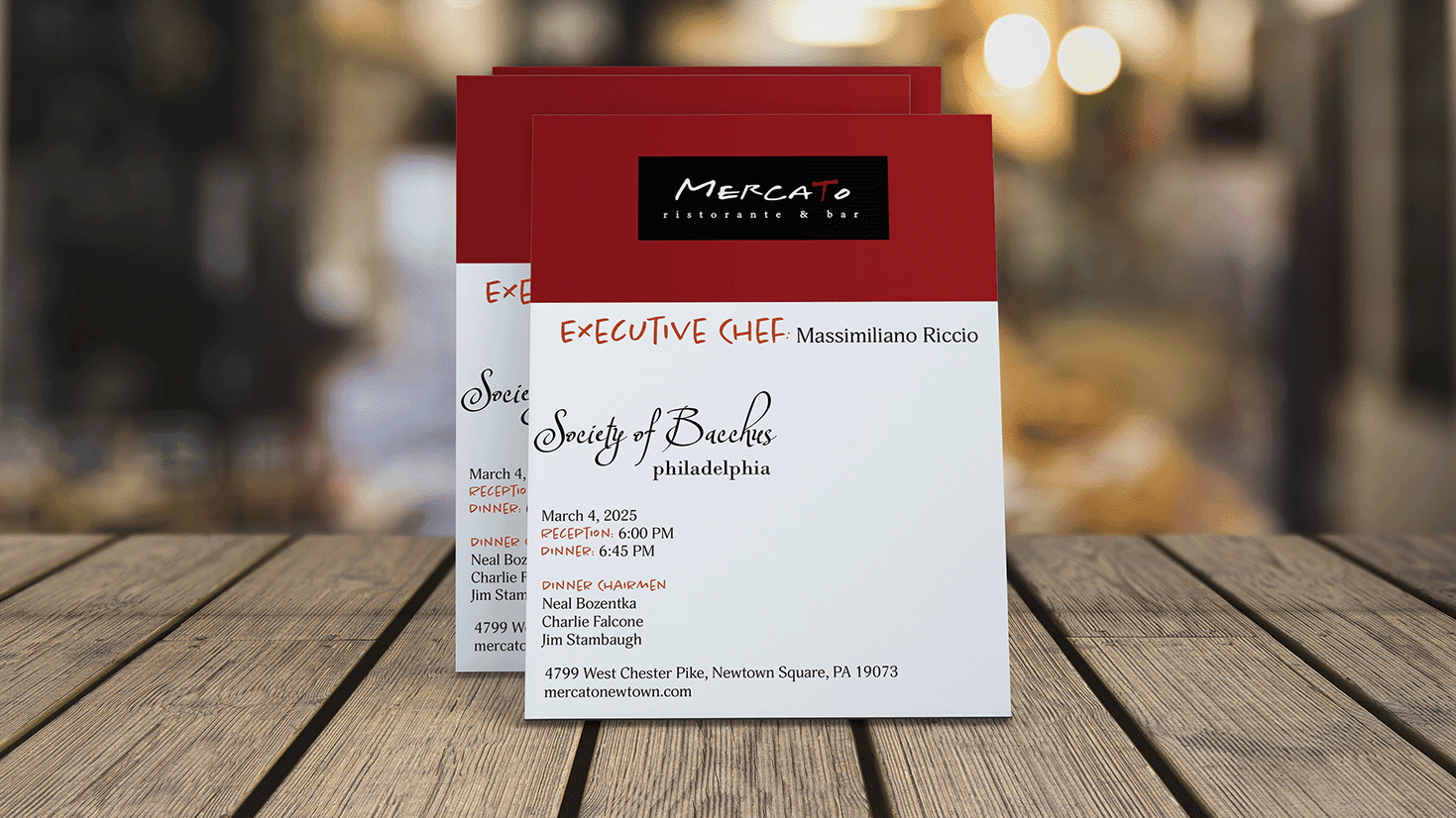
During our initial conversation, the Zoa shared which of my portfolio pieces she liked best. This helped me get a beginning sense of her design sensibilities. Most of the pieces she particularly liked all leveraged a lot of color and texture. The Bacchus menus and the Inner Zen labels both took inspiration and some great textures from vintage art. I wanted to work those themes into the final brand.
Results

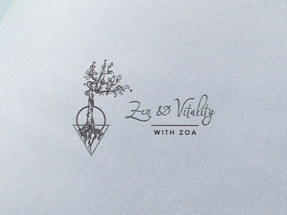
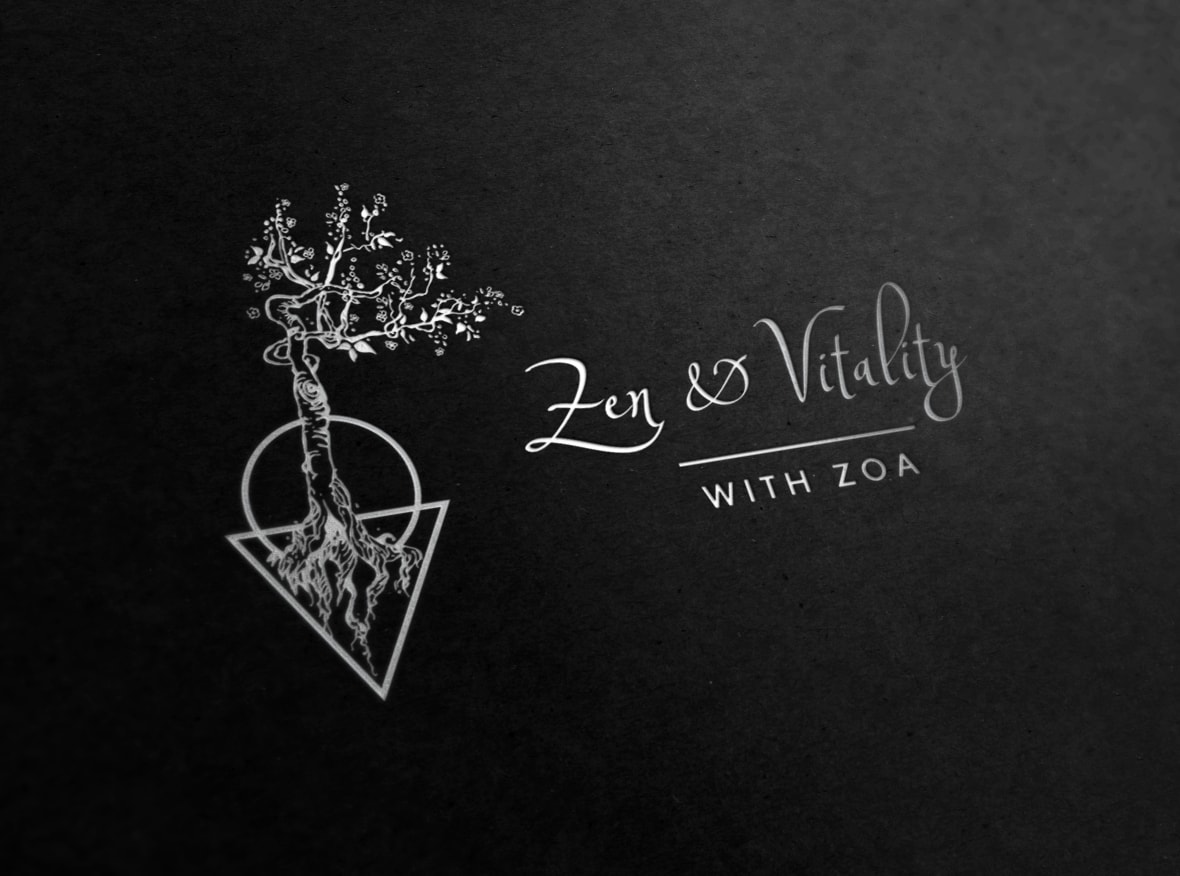
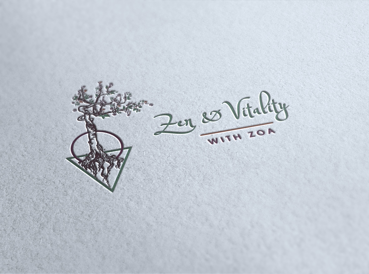
Zoa chose a cherry tree logo with a geometric base. We worked to refine it to include more leaves and blossoms to signify growth. We then worked through several rounds of color to get the set just right, including a live session where we did some fine tuning.
The client was thrilled that we were able to come up with a viable solution to her tight time frame and provided her with a top quality logo. The result and we have something that is fresh and tells the right story for her new business.
Barb was enthusiastic but not pushy. She was supportive but not willing to compromise design integrity. I really like reusing and being efficient so being able to use a design she had already invested time in brought me joy. The fact that we knew each other ages ago was fun!

