
Logo and Collateral Update for a BioPharma Industry Expert
A FRESH LOGO THE TELLS THE ORIGINAL STORY

Brief
This logo was developed for a WAYS Pharmaceutical Services, a company formed to enable Life Sciences Companies to focus on the hard work of drug development and strategy by delivering excellence in regulatory and submission execution. They were ready to update their visual presence and were looking to rework their logo. It needed to show the brand’s core values of trust, compassion and excellence. 100% of their work is on critical path for a client and so they can never have a day where they don’t deliver the best possible services.
The logo needed to simply show their energy, focus and expertise. We worked through several initial concepts, many of them included an arrow or paper airplane shape form the original logo. The final result includes a directional arrow with layered colors to show their multifaceted approach to creating solutions and guidance for clients paired with an elegant, clean typeface.
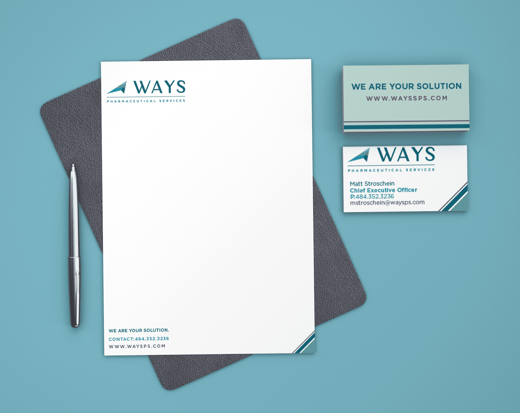
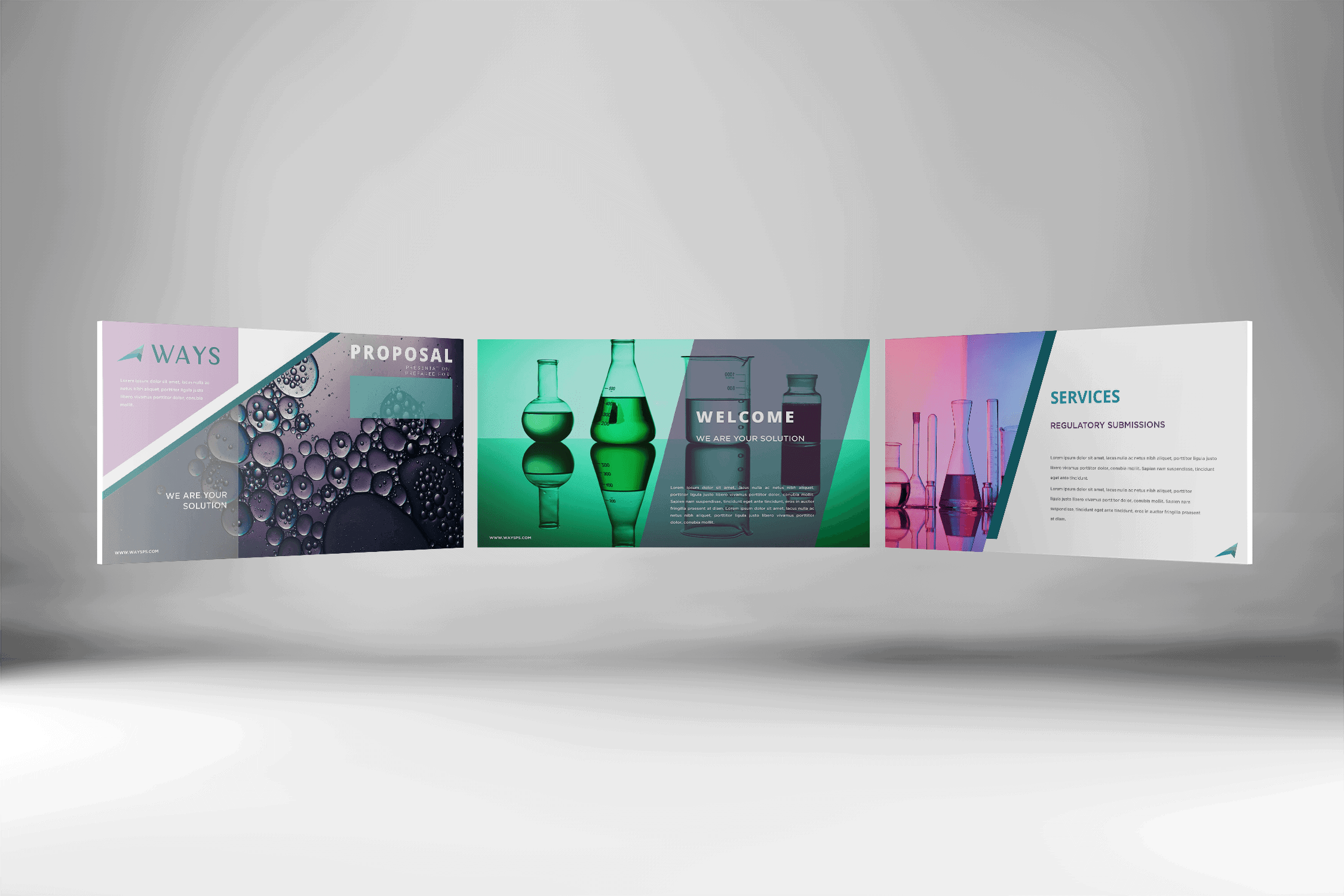
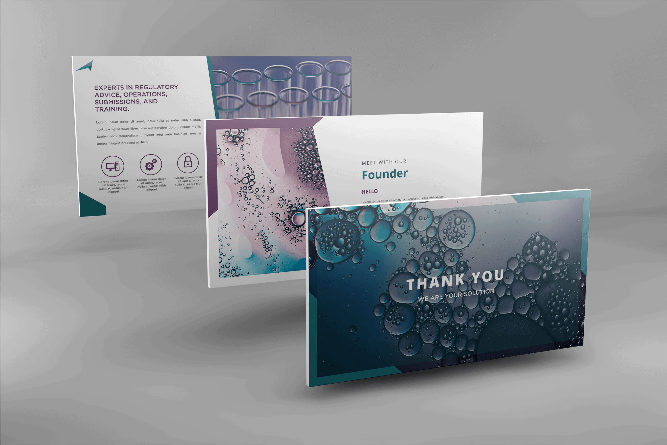
Collateral
Once we had the new logo design set, it was time to update the business cards, letterhead and PowerPoint masters. I leveraged the angles of the logo and included a contrast purple in the official color set for visual interest and to allow for more clear info hierarchy when used in papers and presentations. There is an extensive set of defined and flexible slide masters that allows the client many choice when preparing presentations for clients or webinars.