
Branding Definition and Logo Design
EXPANDED OPTIONS

The Background
Michelle is a master coach who offers guidance for deepening her clients’ personal and spiritual journey. She helps clients get clarity about their life situations so they can make decisions on the next steps that lead to a life of fulfillment and greater meaning.
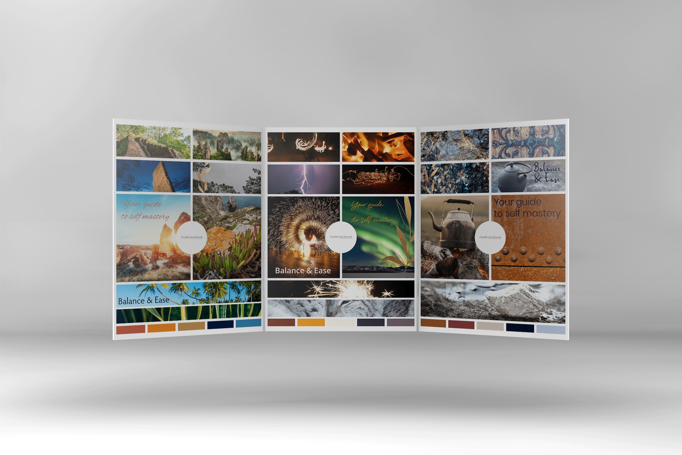
Michelle was looking to update her brand to better reflect her purpose, energy and offerings and to line up with her growth plans. An updated brand would allow her to more effectively tell her story across visual platforms and help attract more of her ideal clients to her. we worked through multiple rounds of images. It was important to Michelle that her images be relevant to her story and heritage, resulting in a truly global set of images. From there we ended up working toward a theme based on the five elements of earth, fire, water, metal and wood. Each of these has a supporting color set.
Spiral as a Life Metaphor
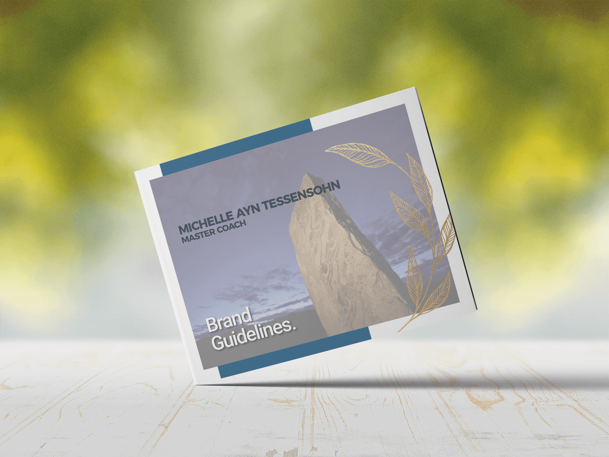
From the initial visuals definition process, I moved on to reworking logo options the pulled together the broad new color set and would work with the variety of images and tones in her new brand visuals.
Web Layouts and Results!
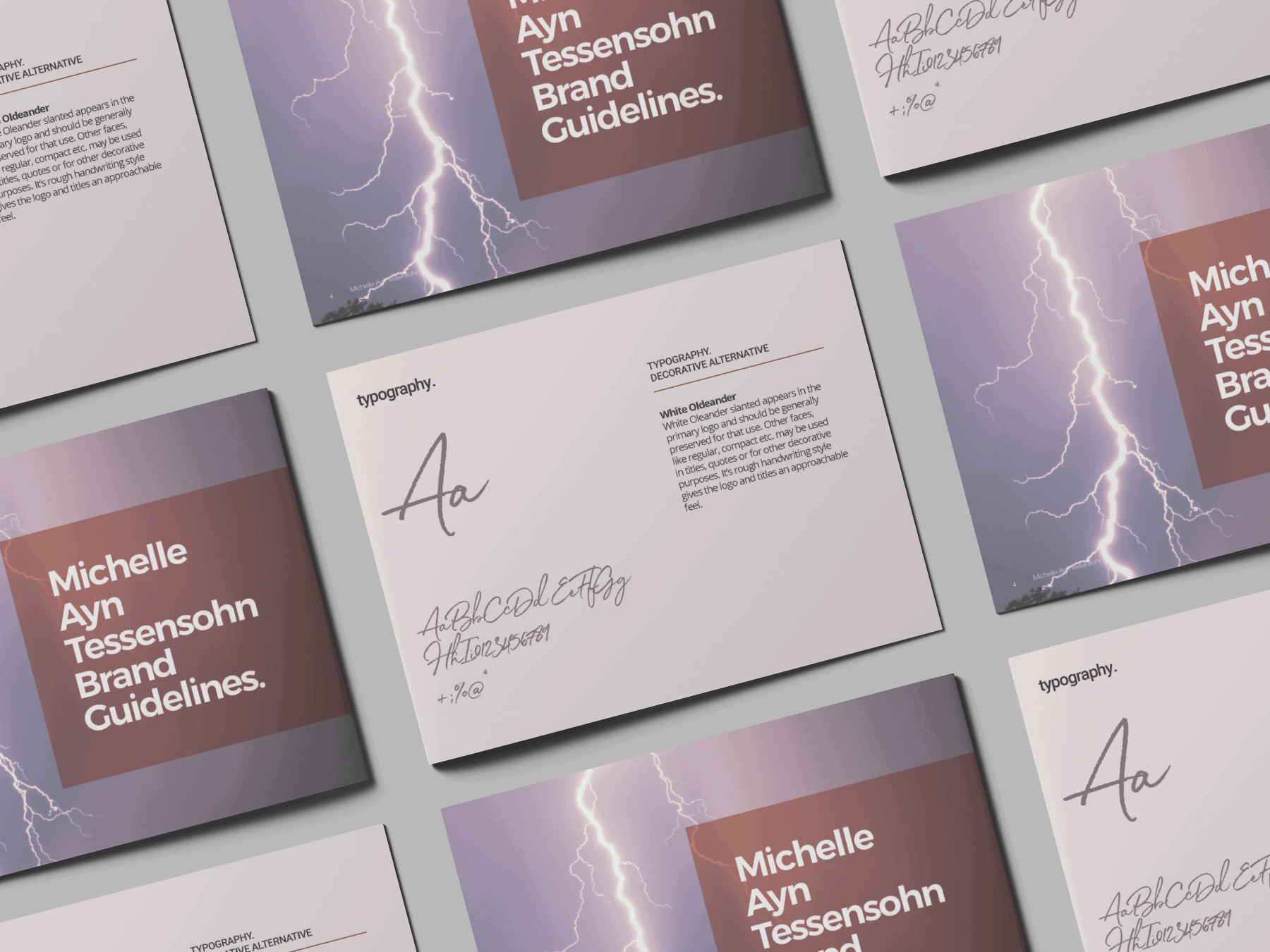
Finally, I pulled it all together in the brand guide, to demonstrate how all the pieces can work together to tell Michelle’s stories.