
Clean & Modern Layout
SPACE & INORMATION

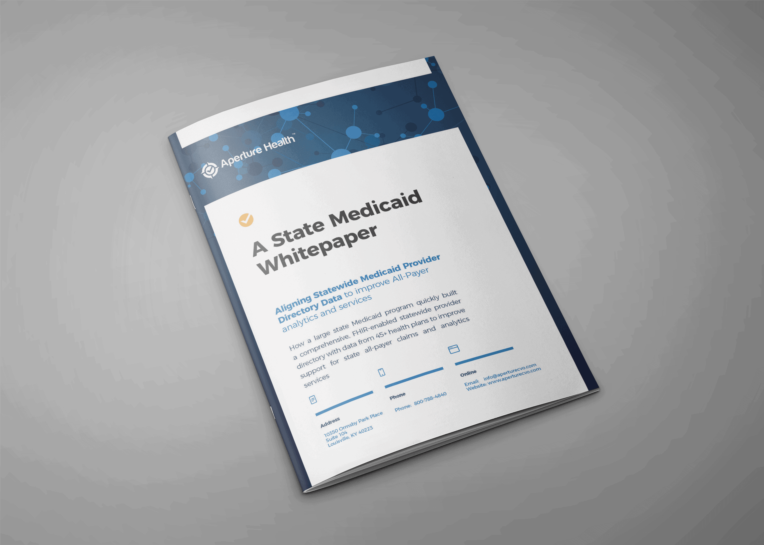
The Background
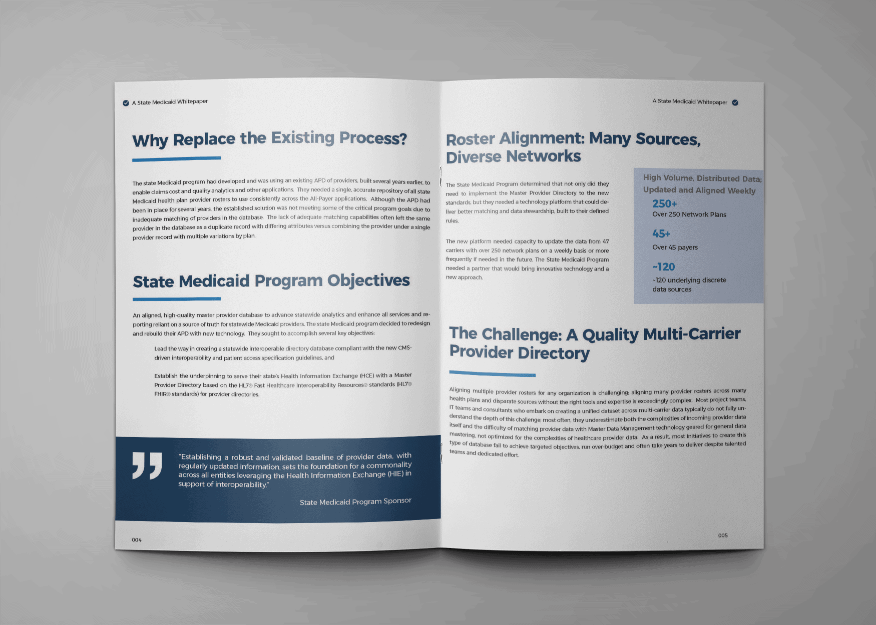
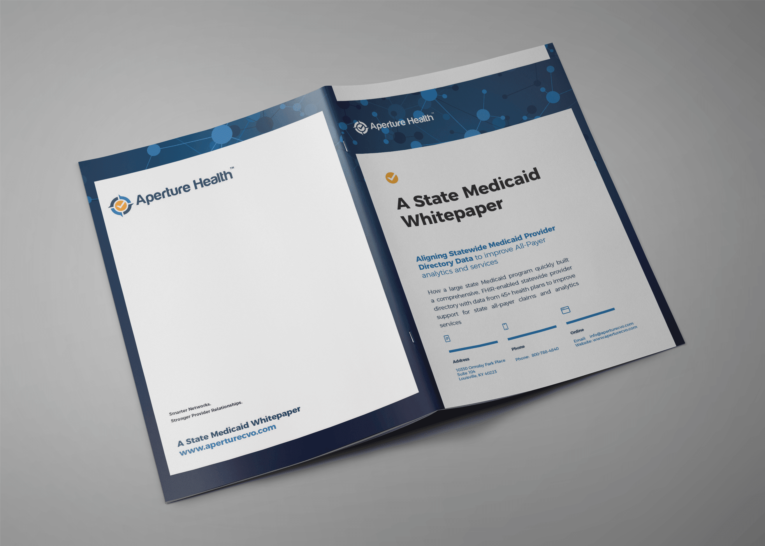
Aperture Health needed a fresh layout for new white paper content. Having recently gone through a brand definition and website update, the new layout needed to line up with the new brand guidelines and use appropriate colors and technology focused imagery. It was important that the information be clear and readable and that the quotes and info-graphics clearly relate to and support the on page content.
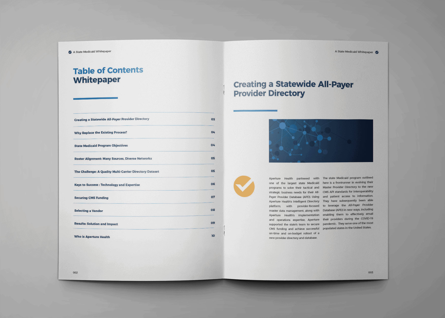
The Result
We worked through a couple of design iterations to land on this clean, largely mono-chromatic design. We’ve used color and font weight to convey sections and called out quotes in bold blocks. This final version of the white paper has the modern, open feel the client was looking for and can be readily adapted to future content. Consistent use of this design will signal to their readers that this is significant content worth their reading time.