Web Makeover for a Prominent Psychologist
COLLABORATION COUNTS

The Background
I was recently invited to collaborate with SallyAnn Gray at Verve Digital Marketing by providing a brand refresh for her client Dr. Amy Wood. Dr. Wood was planning a website update, including fresh content, messaging and visuals. SallyAnn was our project manager par excellence in addition to providing the fine-tuned and beautifully focused new content. Add in to the mix Judi Jones of InfoHarbor for the web development and you have a super powered team of collaborators. This project was so much fun from start to finish.
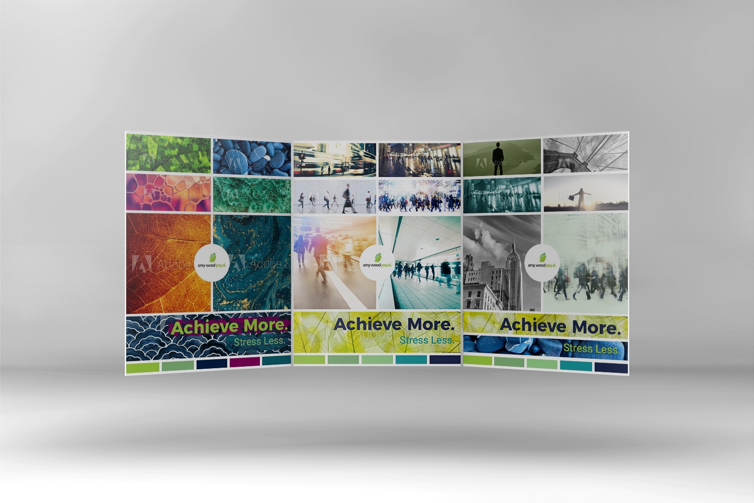
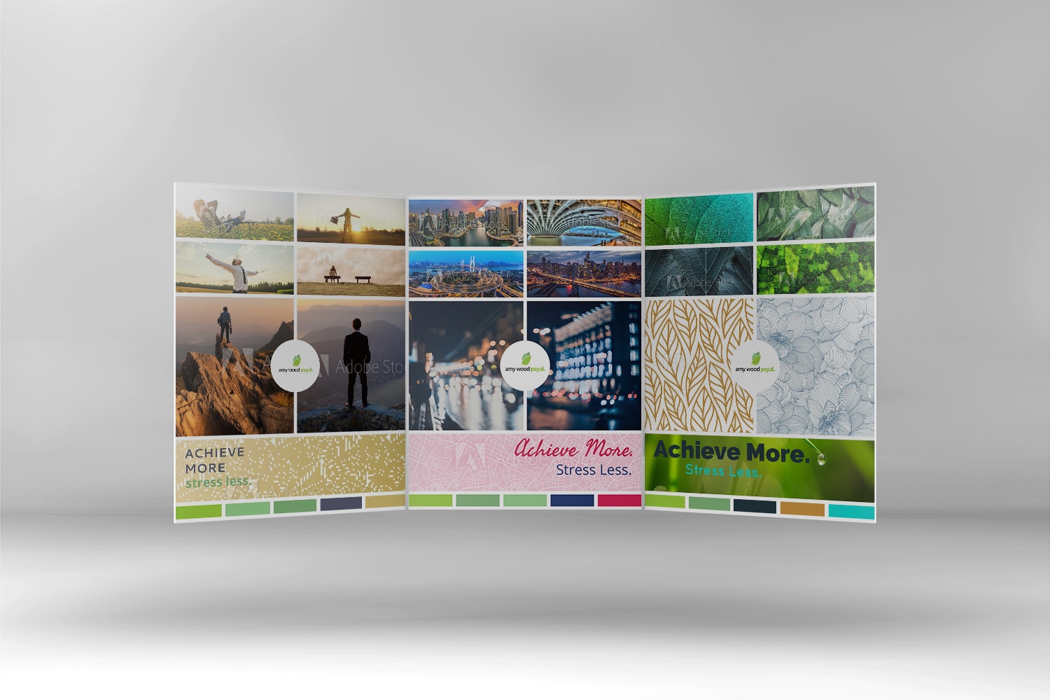
Dr. Wood had a clear vision for her brand and the messages she wanted to convey to her target audiences. We started with a brand interview so I could get a feel for her visual preferences but also what messages or metaphors we needed to convey visually. SallyAnn’s early content work seriously helped inform the design as well. From this interview I pulled out several themes and initial visual concepts and work them into visual story boards. These are a collection of images, colors and sometimes type, that all have a specific theme or flavor. I usually start with several and these get narrowed down to the essential visuals. Dr. Wood really engaged with the process and together we created a suite of visuals, down to individual image selection, that she felt really spoke to her audience and represented her values. In addition to a vibrant color scheme that worked well with her existing logo.
The timing was so right, that we had the colors lined up in time for Dr. Wood to get new headshots, wearing her brand colors, to add to the site!
Defining the Brand

The timing was so right, that we had the colors lined up in time for Dr. Wood to get new headshots, wearing her brand colors, to add to the site!
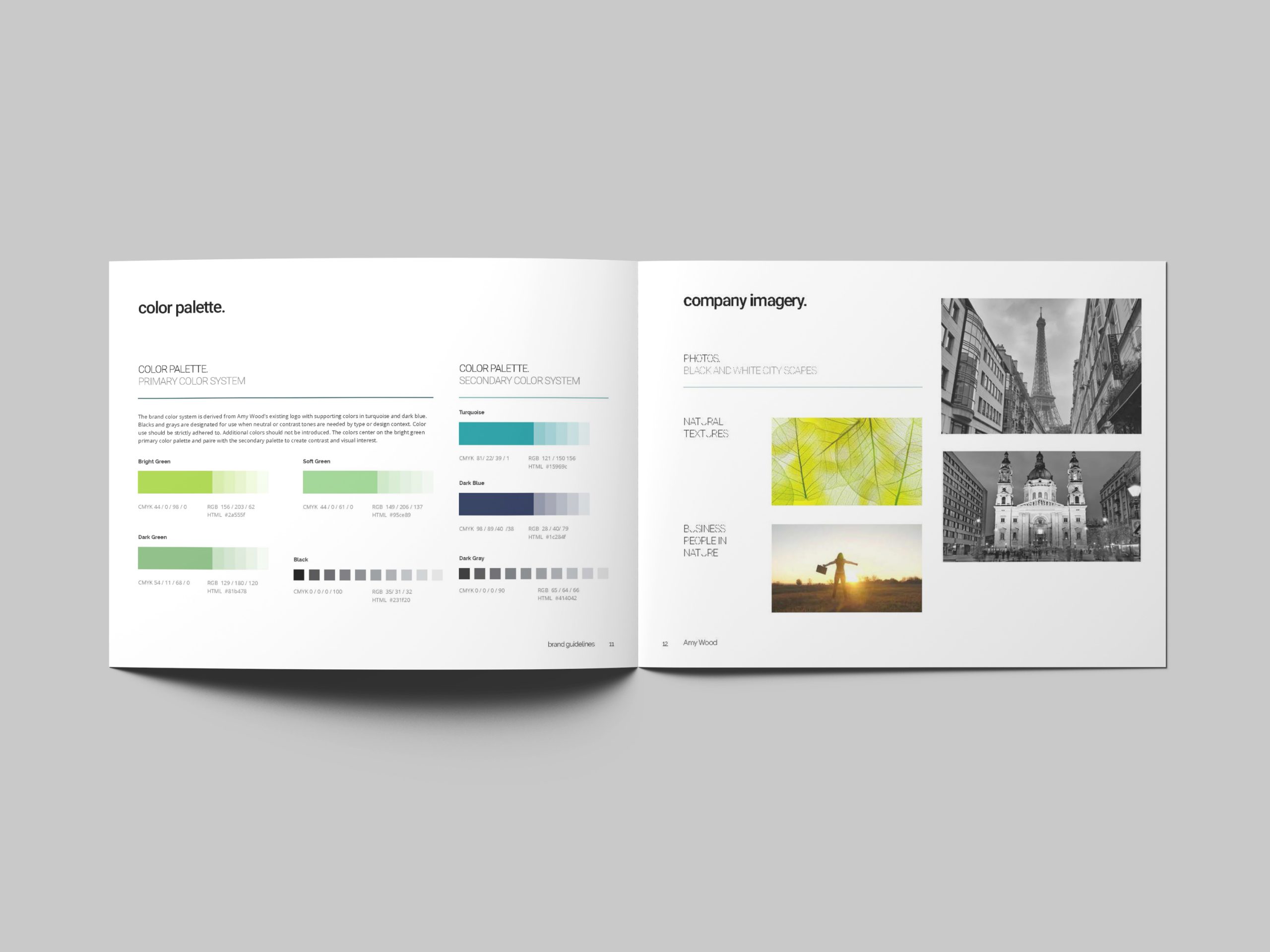
Out of this initial brand work I created the brand guidelines booklet. This definition not only provided the framework for the web design. Dr. Wood now has a tool to provide any other vendors who may be working with her brand in the future.
Web Layouts and Results!
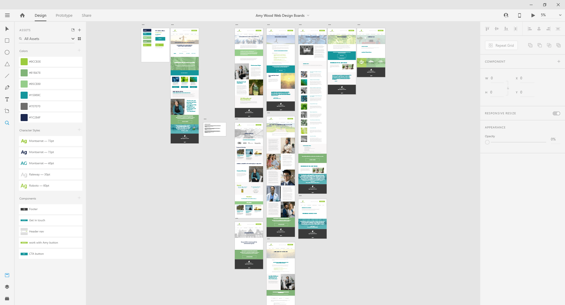
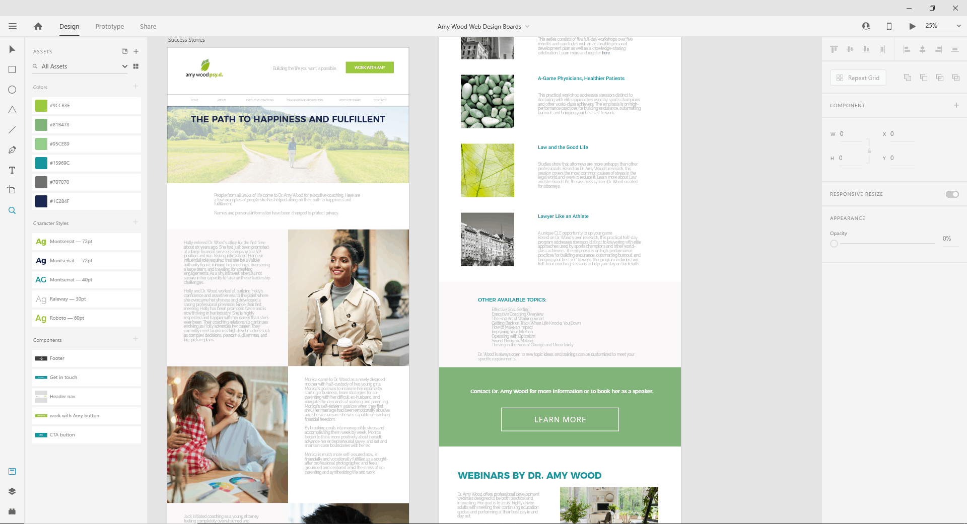
Finally, we dug into the web page layouts. This was my first time introducing a client and collaborators to Adobe XD. It’s a great tool for convey design themes and layout to a developer, but still allowing for flexibility on the live site. Judi was incredibly good at translating the mock-ups into the real site. She’s a true collaborator and provided me with administrator access to the site, so I could play with image choices in a test environment and work directly ion a visual solution for a slider.
The results are in and Dr. Wood is thrilled with her gorgeous new site. Visual themes include business people in nature finding balance, people on the move engaging in life, natural texture, bright skies, paths and gateways, all leading you to a more focused, rewarded, productive and confident you!
“Barbara is very talented at what she does and incredibly easy to collaborate with. I especially appreciate how open she was to my ideas. She really made me feel like a true partner in the process.”
“As the ‘techie’ putting the pieces together from Barbara’s designs, it went very smoothly. Having the pdf view of the design for each page and the assets neatly assembled was a great help and I appreciated it. Barb is very responsive and more than willing to jump in and help to complete the project. Very much enjoyed working with her!”
