
Roots Up
DESIGNING A CALM & PROFESSIONAL BRAND

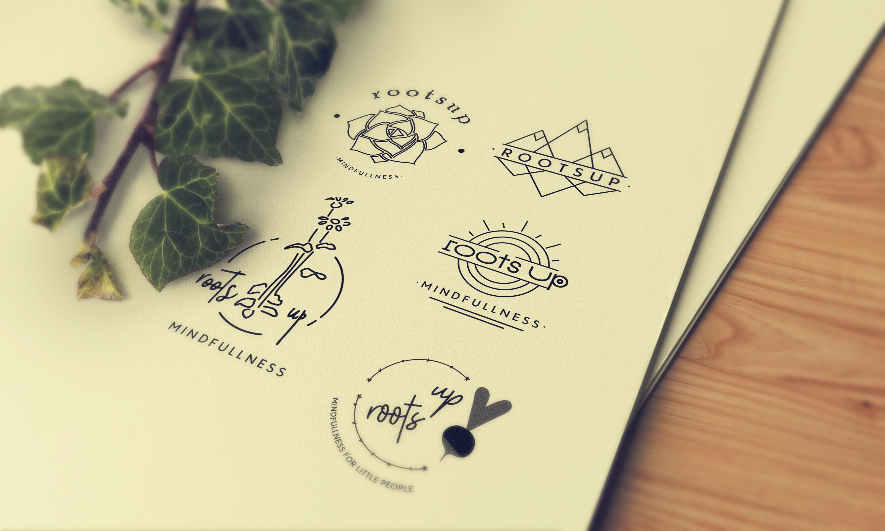
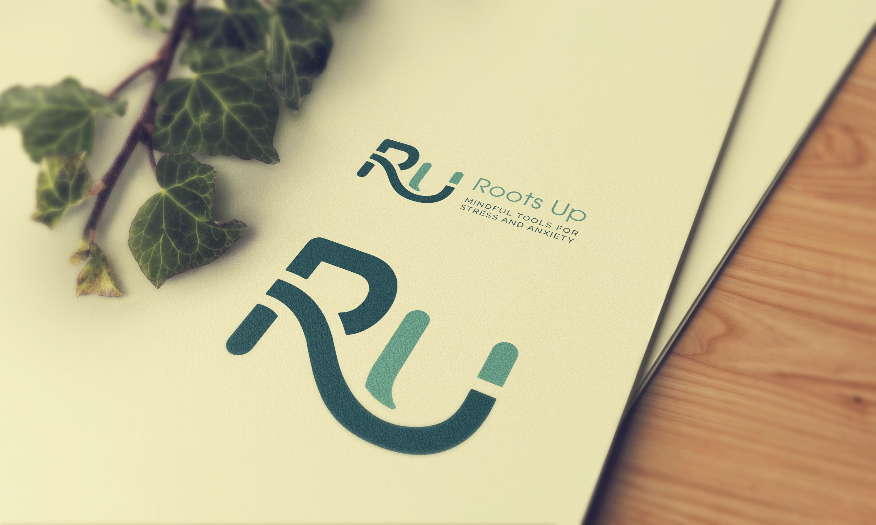
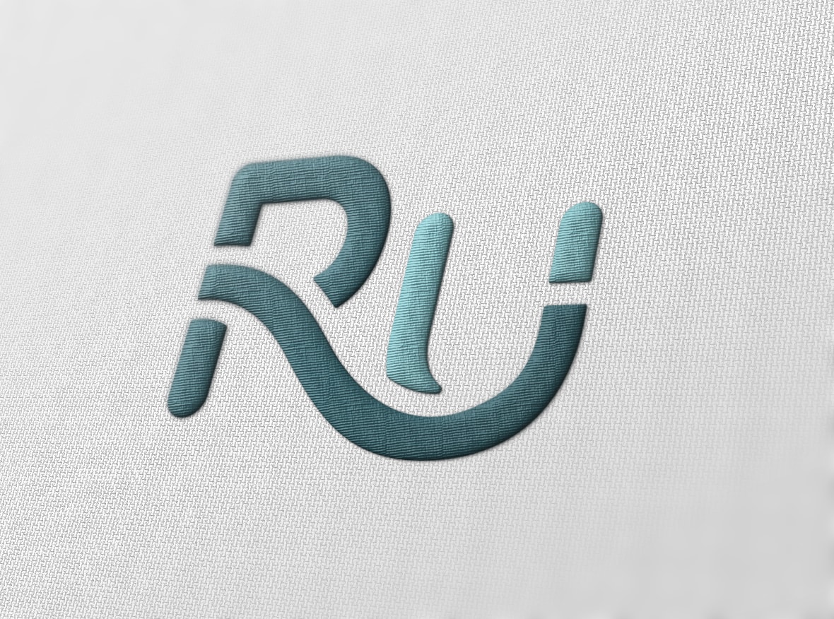
ROUND 1 LOGO CONCEPTS
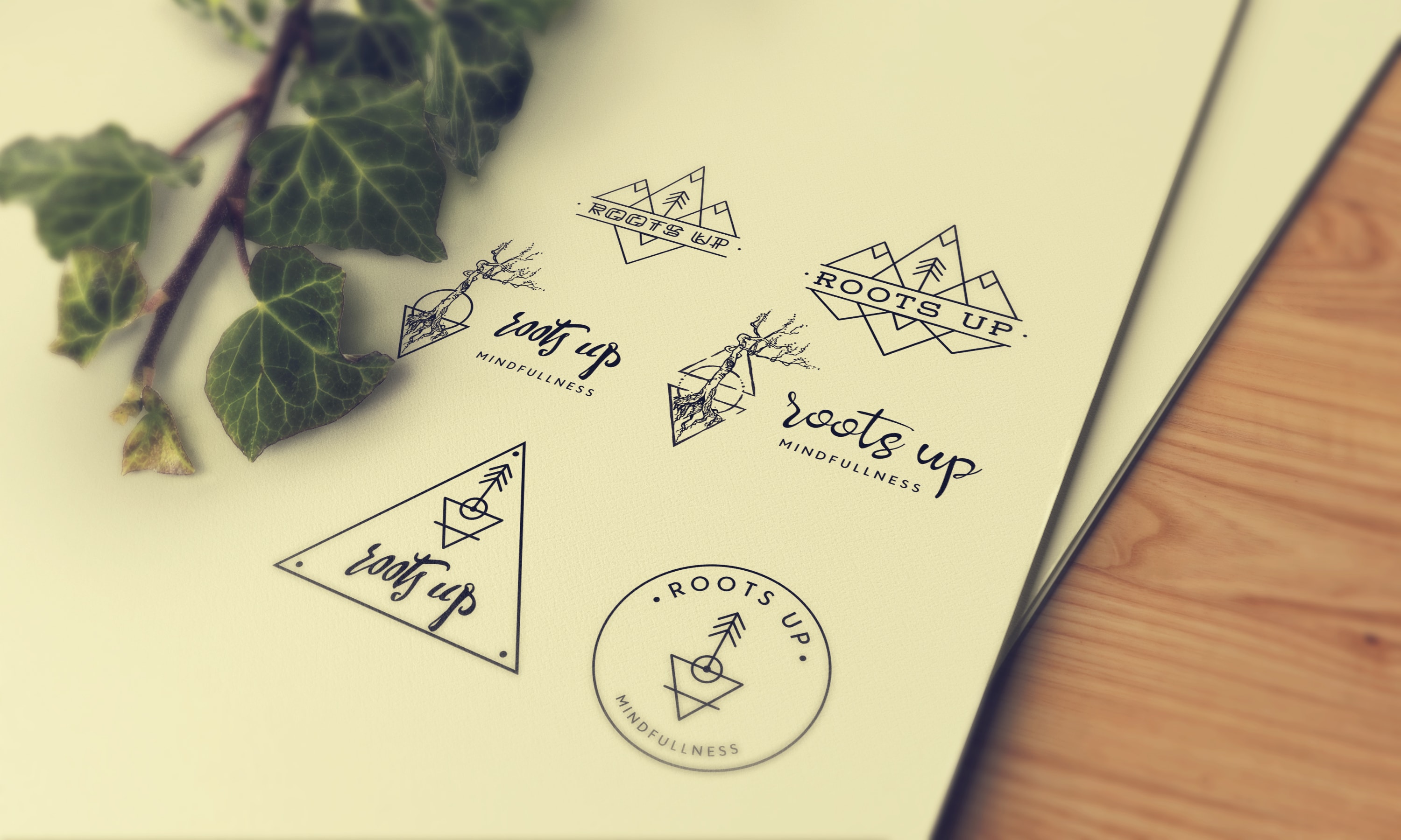
ROUND 2 LOGO CONCEPTS
Brief
I love it when a client really collaborates with me on their design. No seriously. A client who is engaged in the design process and has a vision for the result often pushes me out of my comfort zone and into the realm of great results.
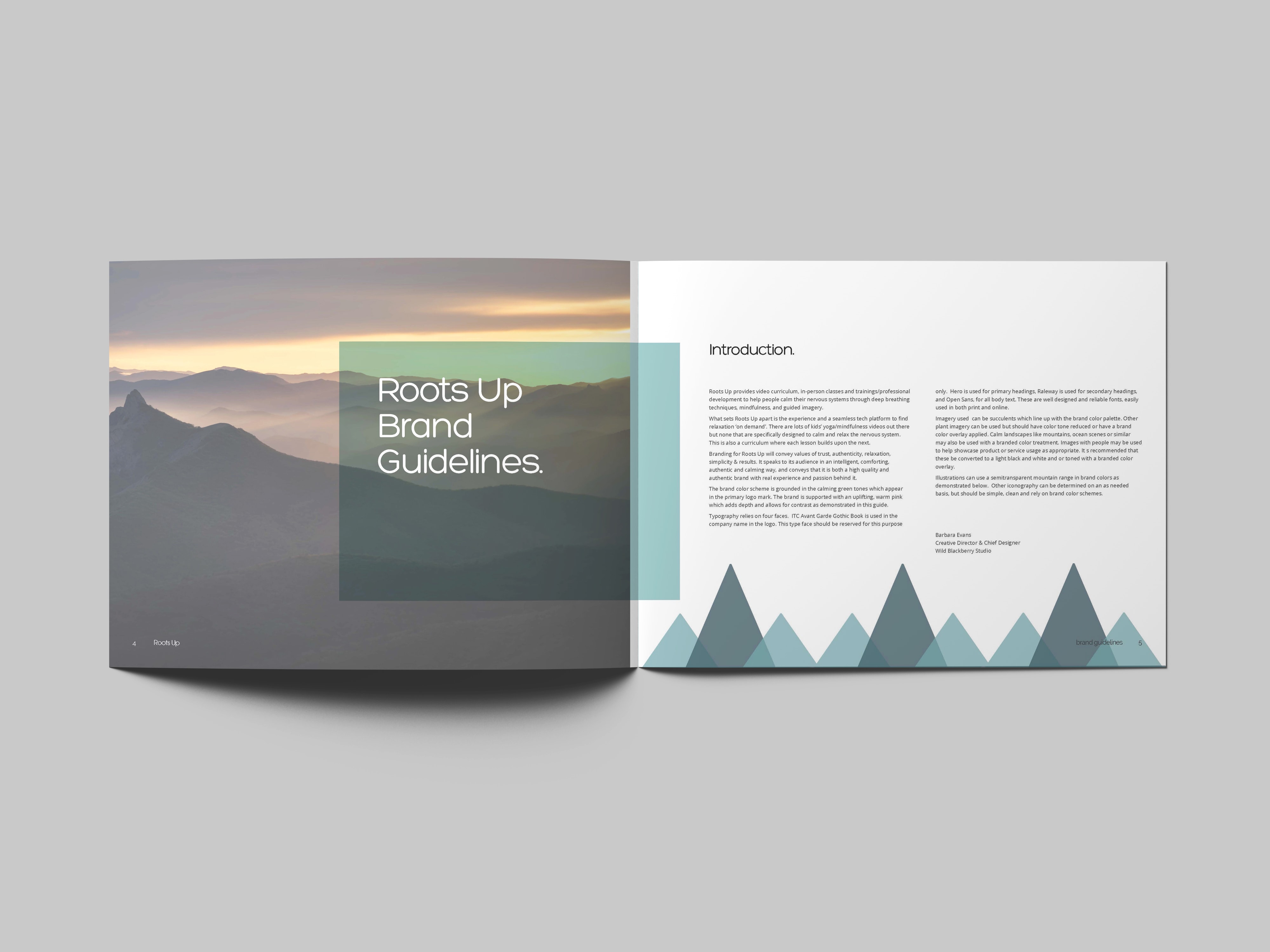
I recently worked through an intensive logo design project with Julie Campilio who is launching Roots Up. Roots Up provides video curriculum, in-person classes and trainings/professional development to help people calm their nervous systems through deep breathing techniques, mindfulness, and guided imagery.
What sets Roots Up apart is the experience and a seamless tech platform to find relaxation ‘on demand’. There are lots of kids’ yoga/mindfulness videos out there but none that are specifically designed to calm and relax the nervous system. This is also a curriculum where each lesson builds upon the next.
We were aiming for a logo with clean modern and simplistic lines. Although parallel and competing programs favor a playful and more childlike design approach, we are speaking to a slightly more corporate audience and will also need to be inclusive of adults and caregivers who may be using the programs and services. Julie created a Pinterest board of styles, images, simple logos and color palettes she liked. This really helped me get a feel for what appealed to her visually and where she wanted to logo to land stylistically.
Results
I worked through several concepts in round 1 and we went with a simple line art design of mountains for refining in round two. After round 2, and some designs that became really stylized, I realized these were simply not resonating with my client. Julie and I had some honest conversation around where to go next. We did one extra round (which I always plan for in my project timeline) and decided to focus on a type treatment logo which would meet our design criteria for modern, simple and professional.
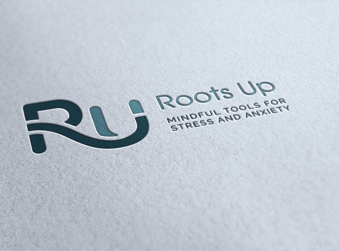
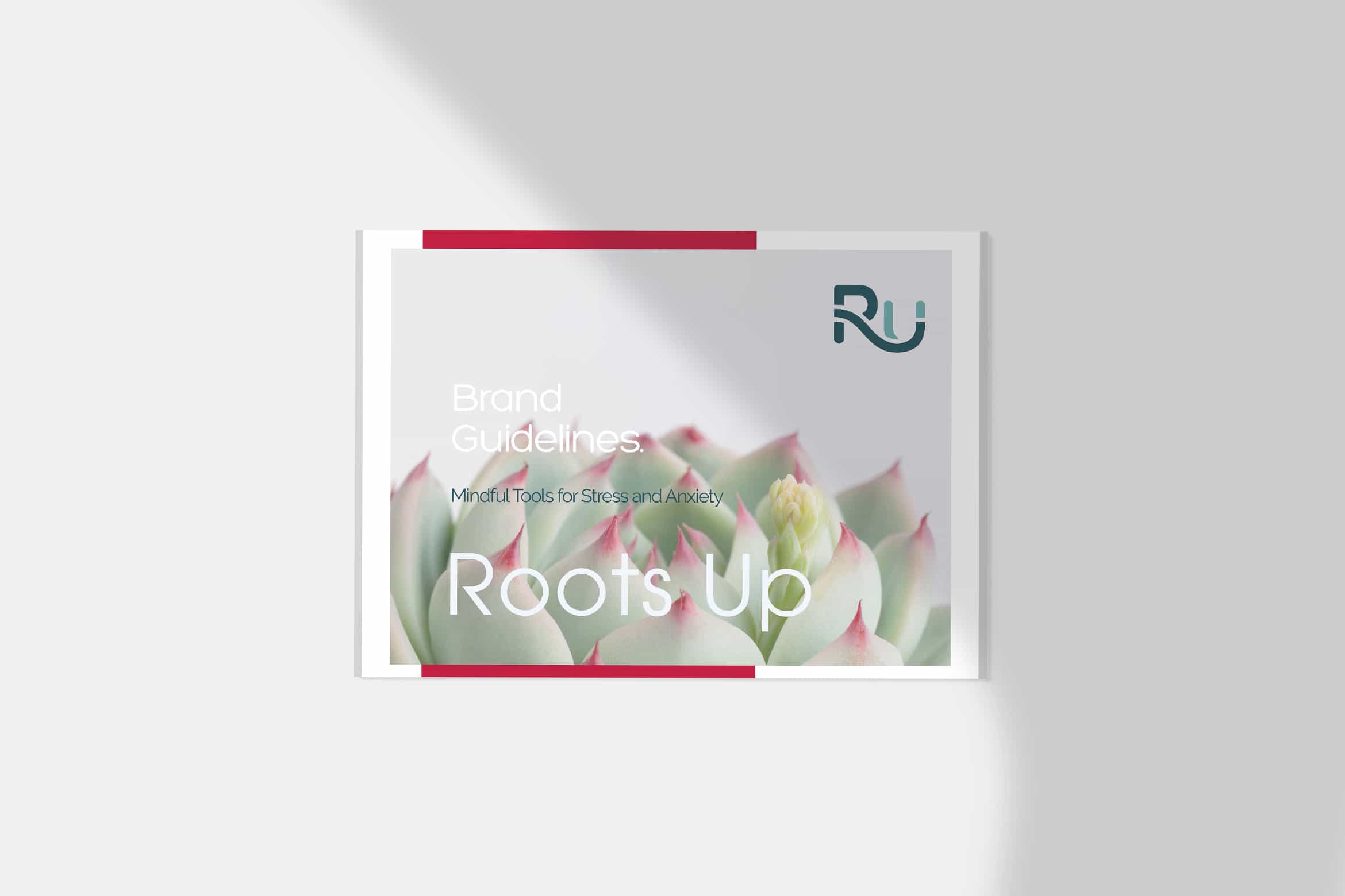
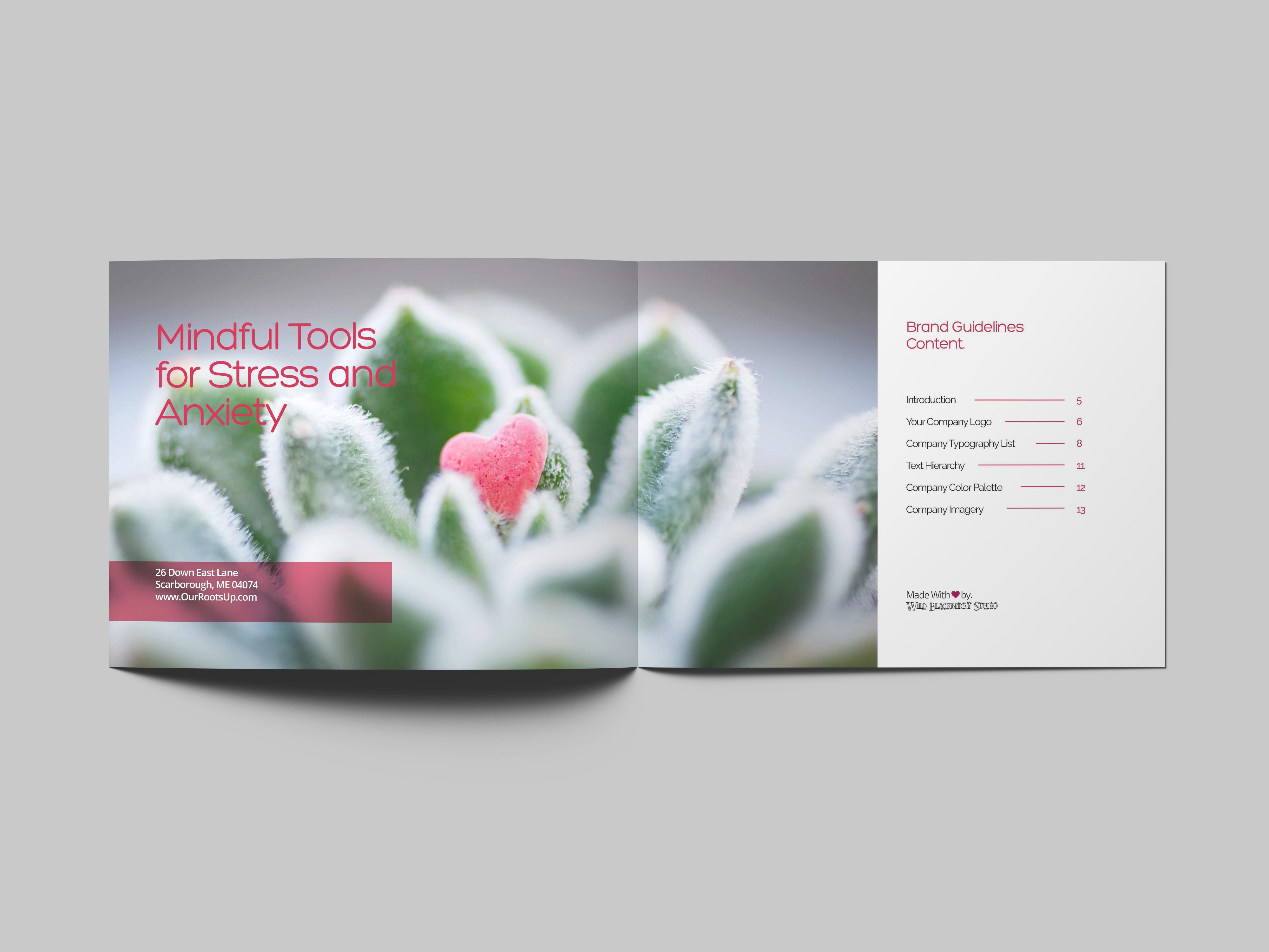
Our final logo is all those things, and with the application of the soothing green color palette, we nailed the original design brief. And, most importantly, my client is thrilled. I also prepared a style guide to support the logo use, provide some guidelines for brand imagery and added a supporting cast of colors (check out the splash of hot pink, pulled from one of our inspiration images). I can’t wait to see what’s next for Roots Up!
PS I had so many ideas while working on this design, I’m having a flash sale on new in box logo concepts!
Barbara was professional, warm and a great listener. She did a beautiful job of combining my ideas about a logo and adding her gifts and talents. Here systems were very seamless and smooth and I would definitely recommend her business to others.