
Giving a Great Service a Great Brand Update
COLORS & GEOGRAPHY

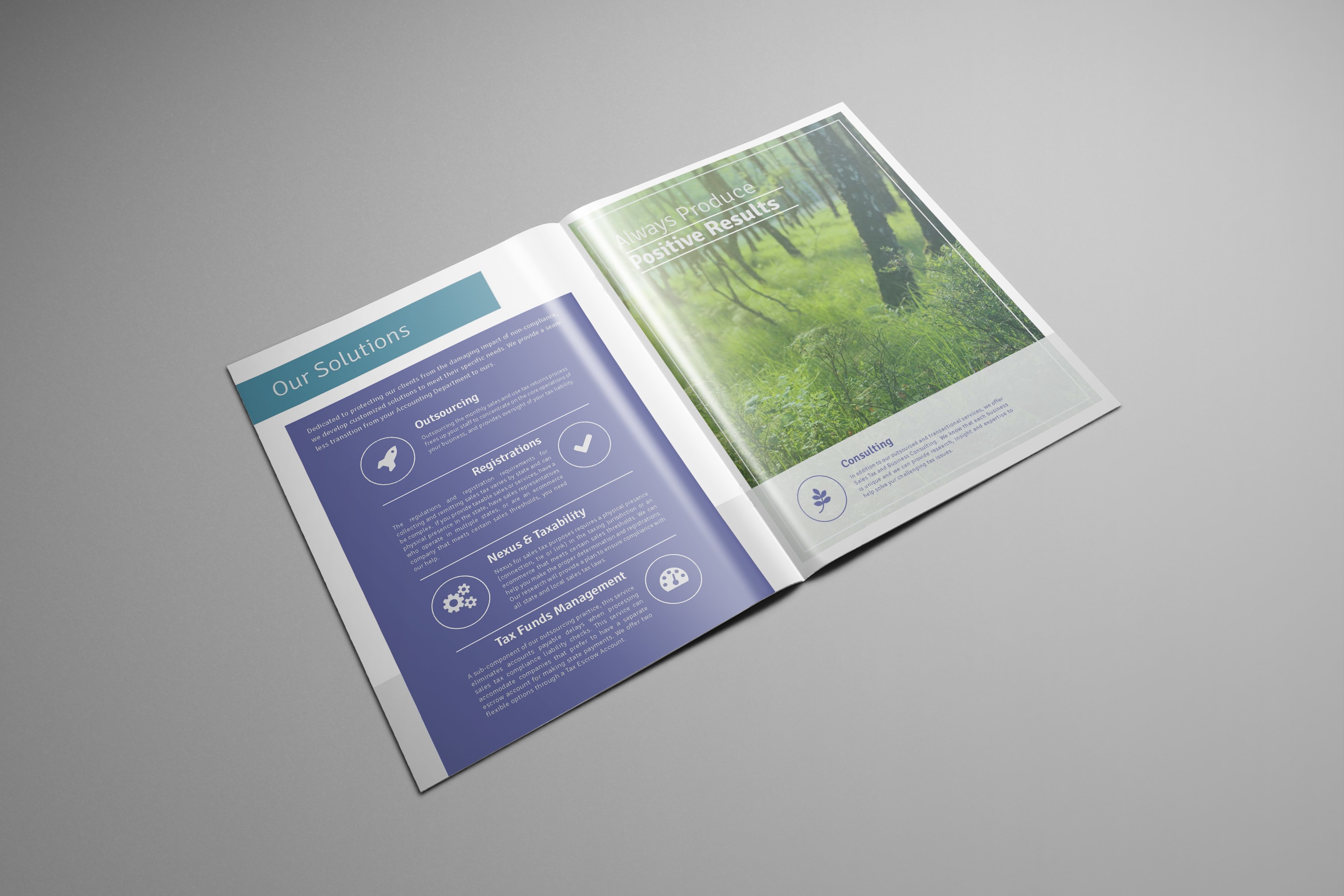
The Background
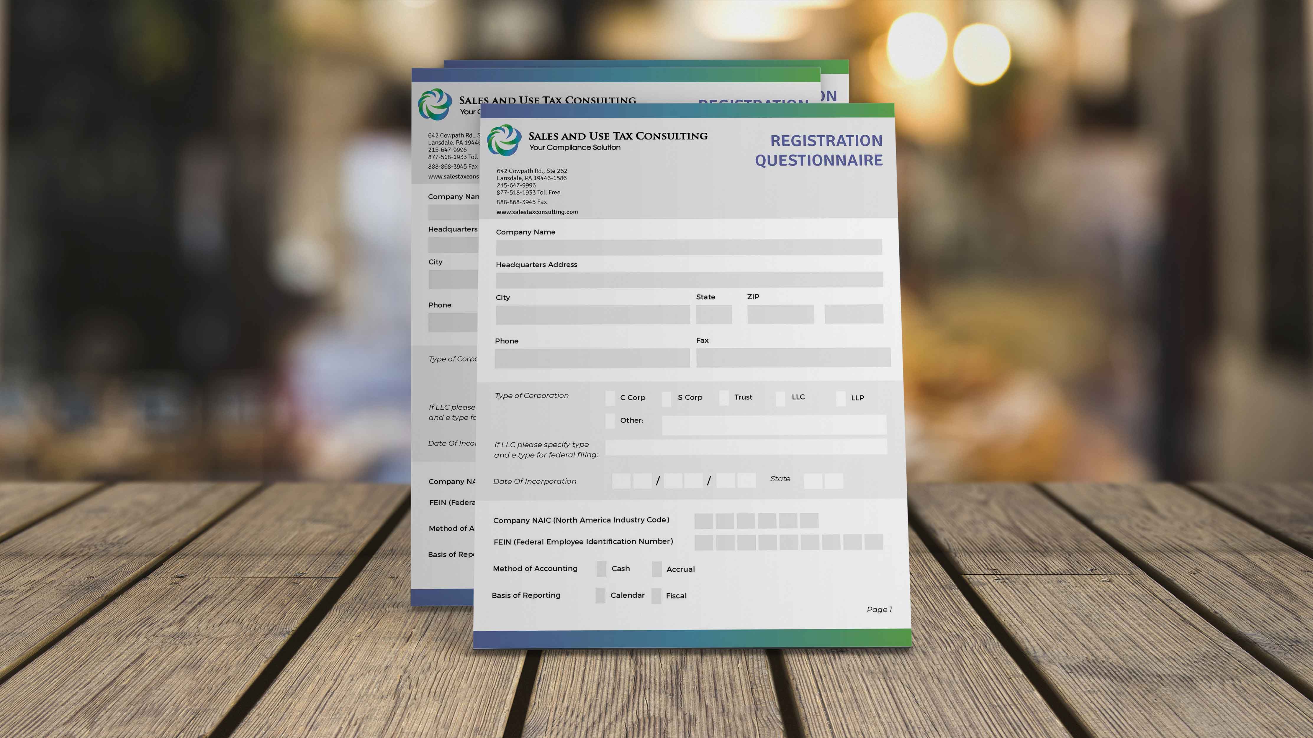
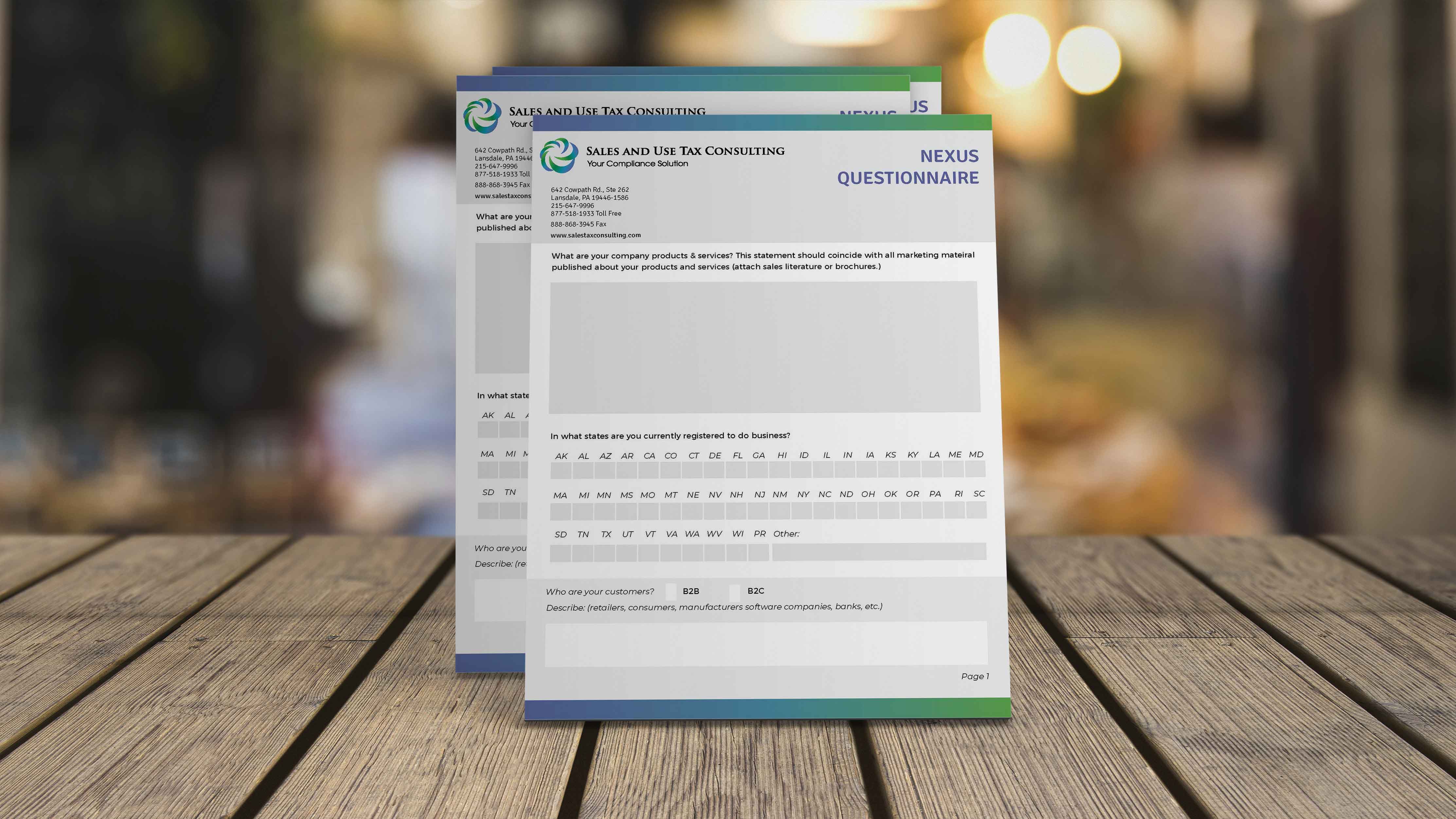
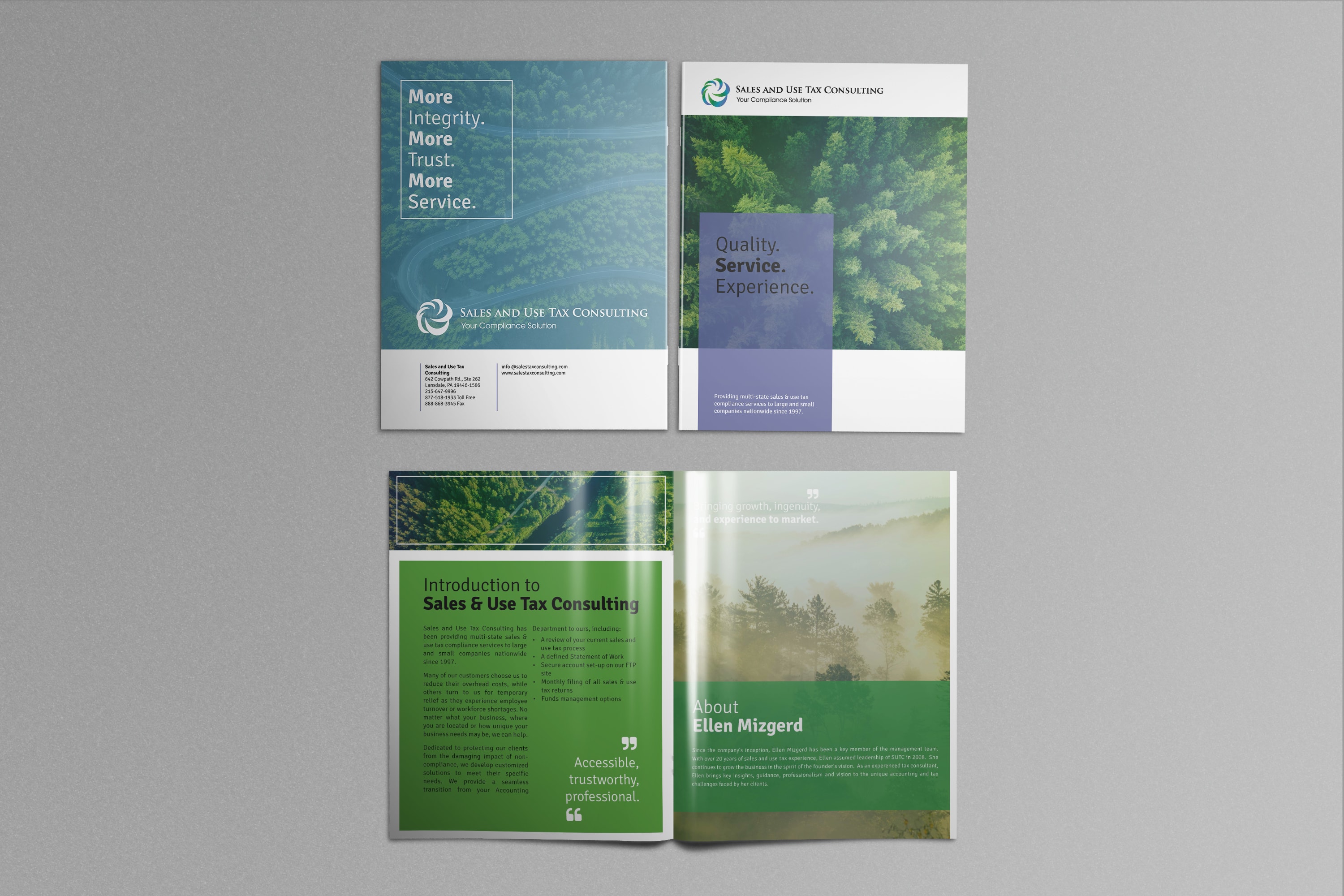
I met up with Ellen from Sales & Use Tax Consulting to talk through her current websites and other marketing materials. We ended up having a lot of fun talking through operations, systems, marketing plans and customer experience. The result was that we targeted one of her sales documents for a facelift. The document itself only existed in word and was trying to accomplish a lot of things. We decided to break out the document into multiple pieces, including a marketing brochure, on-boarding instructions and as a follow up project, some registration forms.
Ellen really wanted the brand update to reflect her personality, her connections with nature and her sense of humor and to leverage the color scheme in her logo. It also needed to convey a sense of calm and professionalism to her clients. I created a design using her lovely soothing color palette and using images with forests and some road or pathway through. The photos were all treated with a gradient overlay to bring them in line with her brand colors and give them the same feel. The blocky design really works nicely to showcase her color scheme.
Doing One Job at a Time
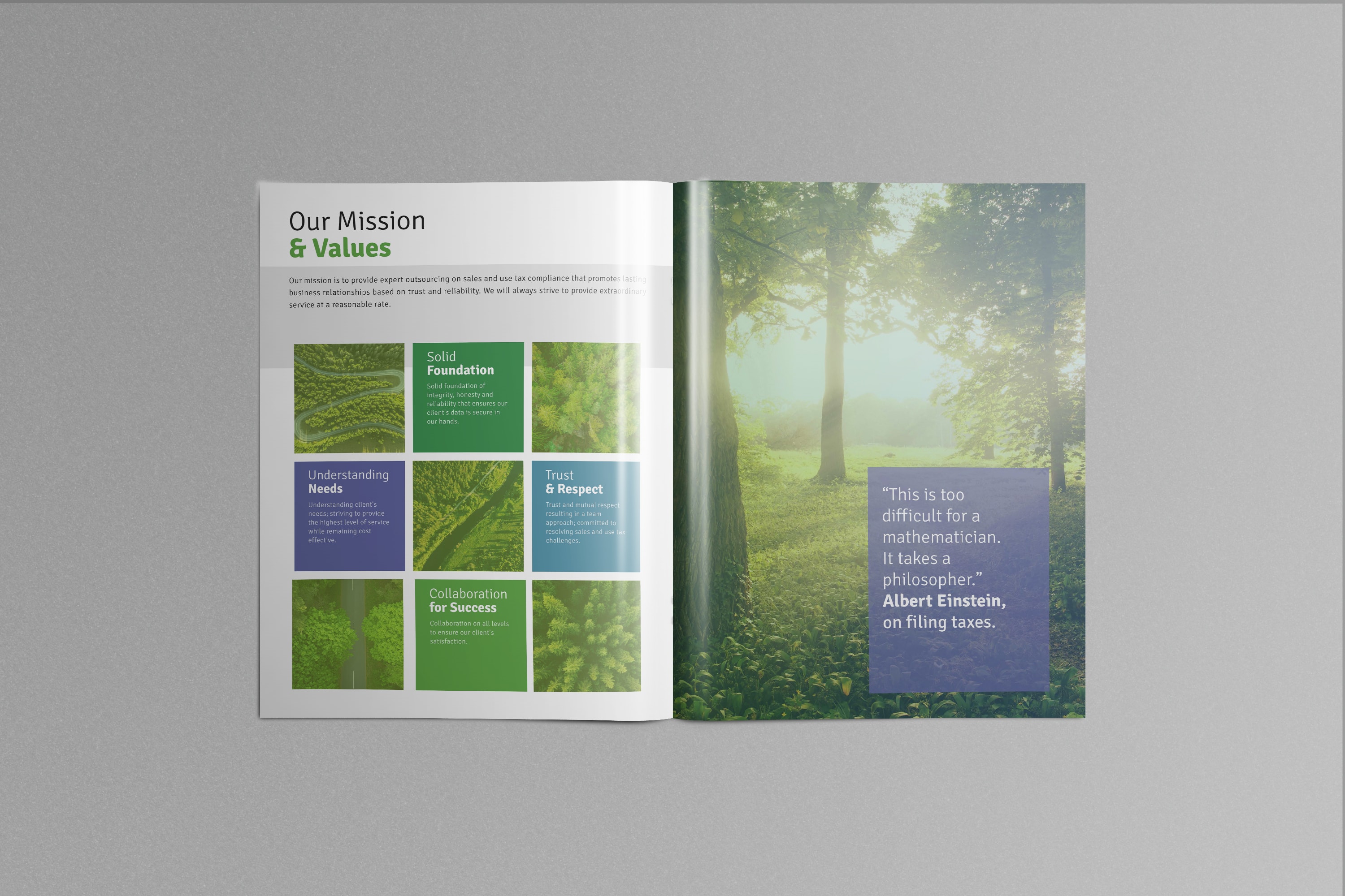
The part two round gave a list of questions from a simple word doc a major facelift. I kept these really simple, leveraging the color scheme and gradient for some visual interest. These documents are laid out to work as a print PDF but are also ready to be converted to an interactive document that can be edited and saved by the client’s end users. My client is thrilled!
And, by the way, if you need expert support on sales and use tax, you can reach Ellen here: